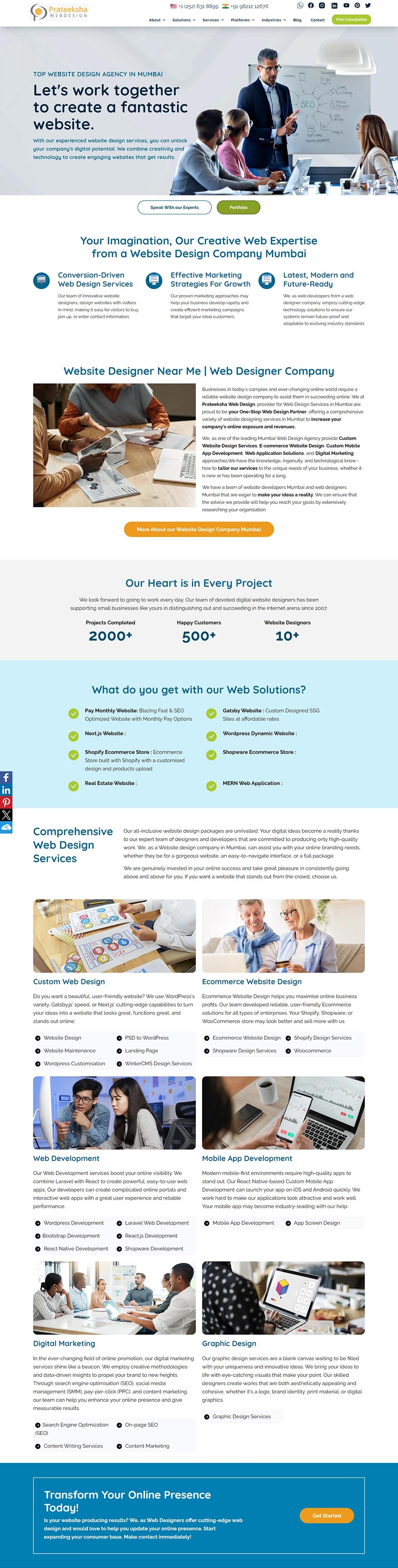
1. Prateeksha Web Design Company | Top Web Design and Development Company, Andheri, Mumbai
The design utilizes a clean, corporate aesthetic with a blue and green color palette, conveying professionalism. Crisp imagery paired with clear, concise text sections promotes easy navigation and a strong brand message.
The layout is structured with ample white space and a well-organized hierarchy of information, allowing for quick user orientation. The use of icons and varied typography helps to differentiate services and guide the user's eye through the content.
Call-to-action buttons are prominently displayed, encouraging user engagement. The website balances visual appeal with functionality, showcasing credibility and a customer-focused approach to web design services.
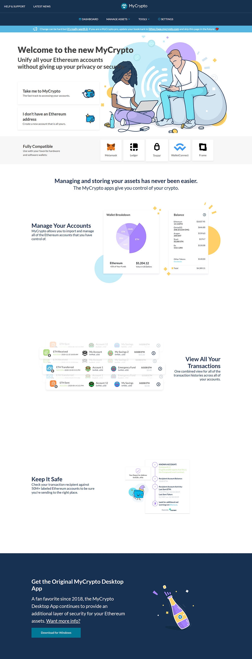
2. MyCrypto | Ethereum Wallet Manager
MyCrypto | Ethereum Wallet Manager
The design presents a modern, clean interface with a light color palette that emphasizes blues and purples, conveying a sense of trust and technological sophistication. It uses flat design icons and illustrations to create a friendly user experience. Clear typography and ample white space ensure readability and focus on content hierarchy.
The use of illustrative elements featuring characters adds a personal touch, suggesting ease of use and accessibility. The layout is strategically organized, employing cards and sections to compartmentalize information, which streamlines navigation and comprehension.
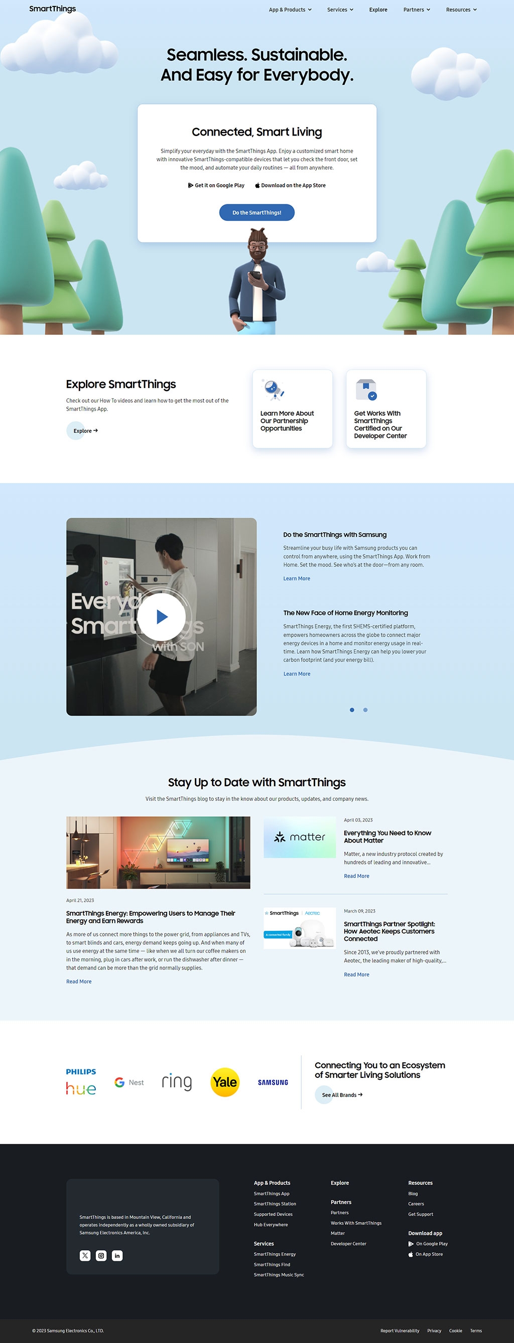
3. SmartThings | Your Smart Home Starts With SmartThings
Your Smart Home Starts With SmartThings
Featuring a clean layout with a cool color palette of blues, grays, and whites that evoke a sense of tech-savviness and reliability. Playful graphics and cloud elements add to the brand's approachable image.the use of whitespace is generous, creating an open and uncluttered interface that guides the user's eye to key sections like app download buttons and informational videos, ensuring a seamless navigation experience.
Typography is modern and legible, with a hierarchical structure that uses size and weight to distinguish between headings and body text, while iconography and partner logos are well-integrated, contributing to the site's professional and polished look.
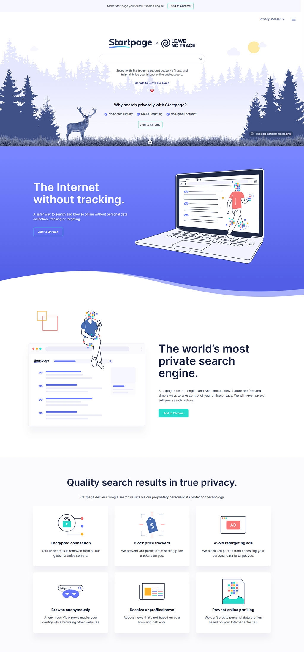
4. Startpage | Private Search Engine. No Tracking. No Search History
Startpage | Private Search Engine
The design employs a crisp, minimalistic aesthetic with a dominant blue color scheme that communicates trust and security, appropriate for a privacy-focused search engine. The top section uses an outdoor nature scene, possibly to symbolize freedom and purity, aligning with the "Leave No Trace" partnership.
Line illustrations, flat icons, and ample white space create a friendly and accessible user interface, promoting ease of understanding while emphasizing privacy features. The visuals and icons are simple and informative, enabling quick comprehension of the service's benefits.
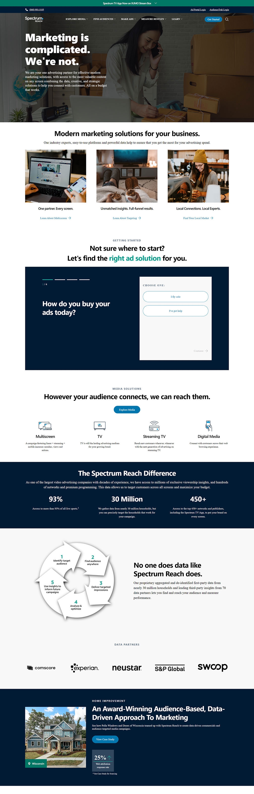
5. Spectrum Reach | One Advertising Partner and Done
Spectrum Reach | One Advertising Partner
The design adopts a professional and straightforward approach with a focus on clarity and ease of navigation. The use of human-centric imagery in the hero section establishes a connection with the viewer and the context of marketing services.
The interface below the fold is clean, with a combination of dark and light backgrounds that segment information for a balanced, high-contrast look. Calls-to-action are highlighted through the use of color, drawing attention effectively.
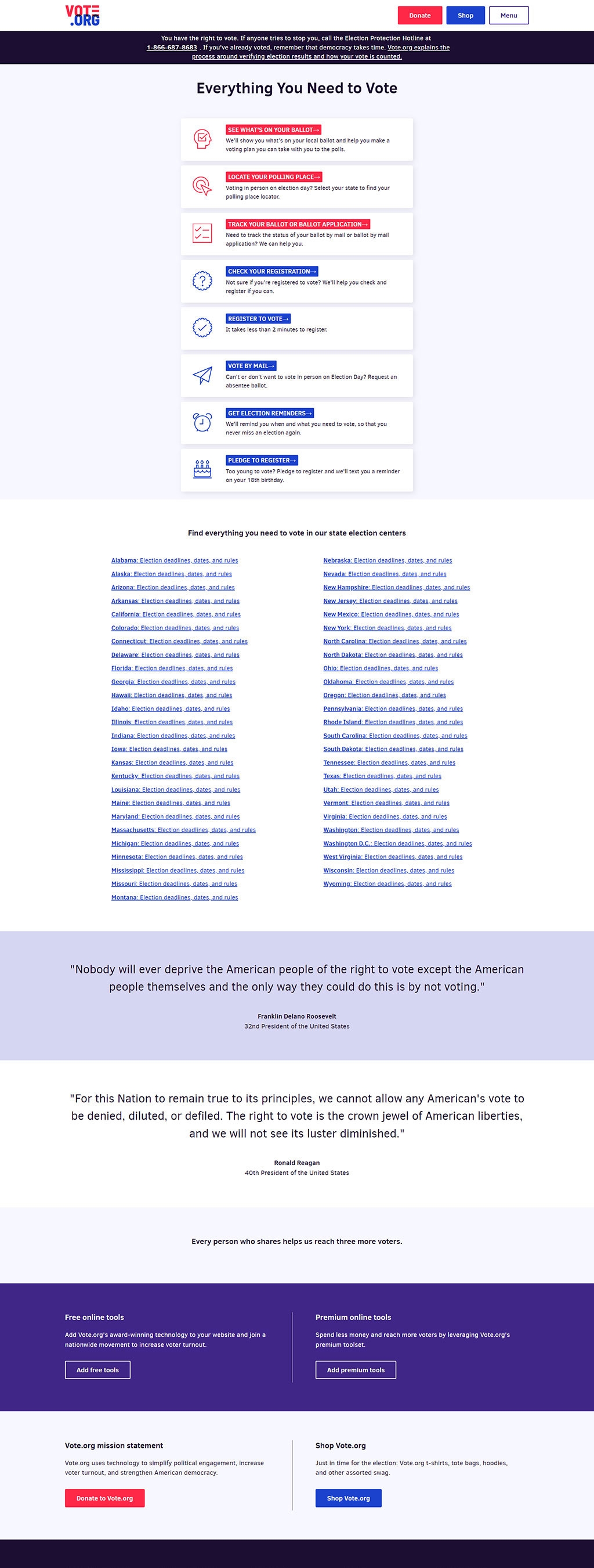
6. Vote.org | Everything You Need to Vote
Vote.org | Everything You Need to Vote
The design employs a patriotic color palette, with red, white, and blue dominating the scheme, reinforcing the website's purpose related to voting in the United States. Icons and buttons are distinctly styled for easy user interaction, with clear typography ensuring readability.
A straightforward layout with links to state-specific voting information presents a user-friendly approach, enabling easy navigation. The central alignment of elements and use of ample white space enhances the layout's clarity and focus.
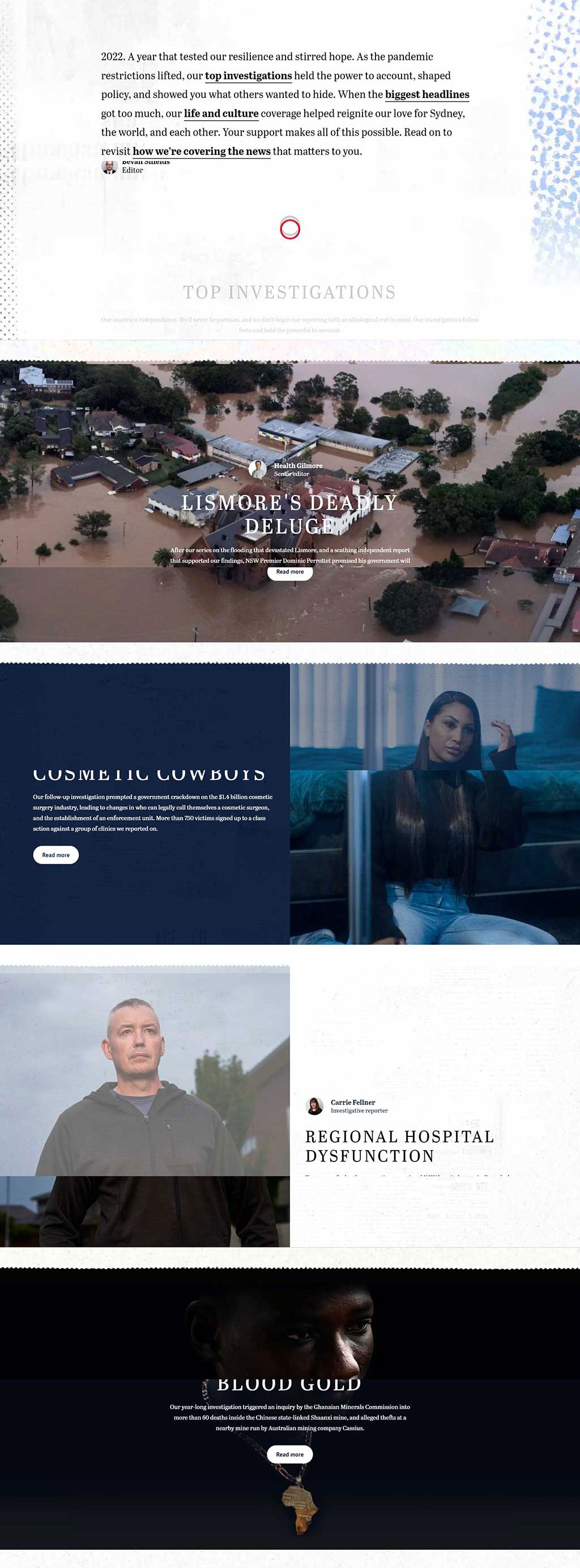
7. The Sydney Morning Herald Impact Report
The Sydney Morning Herald Impact Report
The design employs a compelling blend of high-quality images and typography to narrate a story, using a restrained color palette that emphasizes the content. Subtle textural backgrounds and clean sans-serif fonts convey a modern, journalistic feel, while also ensuring legibility.
Visual hierarchy is established through the use of bold, dark headings against lighter backgrounds, drawing the eye to key stories and sections. The sparing use of color highlights important actions and navigational elements, aiding user engagement.
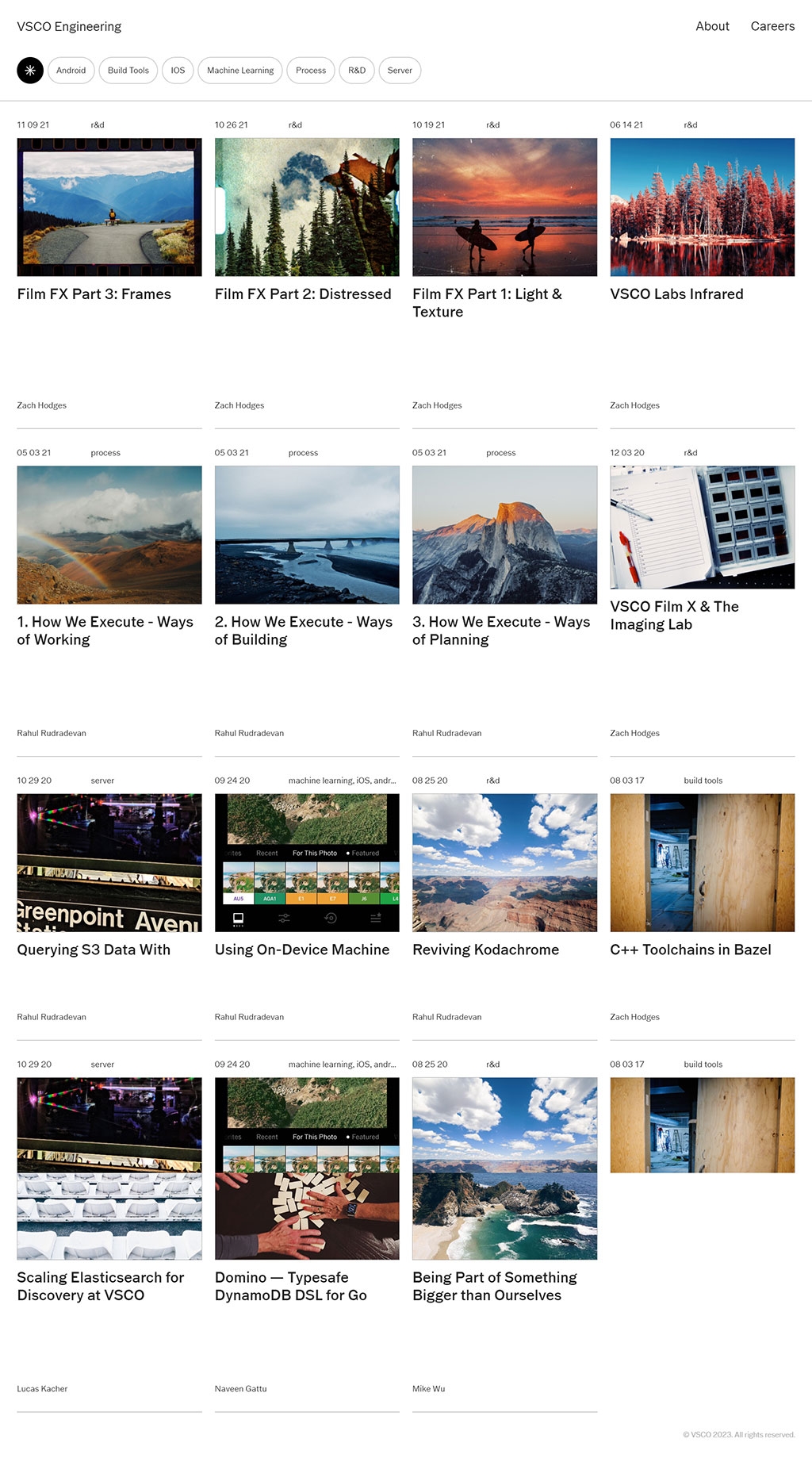
8. VSCO Engineering
The design utilizes a clean, grid-based layout, showcasing vivid imagery to captivate viewers, accompanied by minimalistic typography that complements the visual content without overwhelming it.
Categorization tags and authorship details are neatly organized, offering a clear, user-friendly navigation system that enhances the browsing experience and efficiently guides the user's journey through the content.
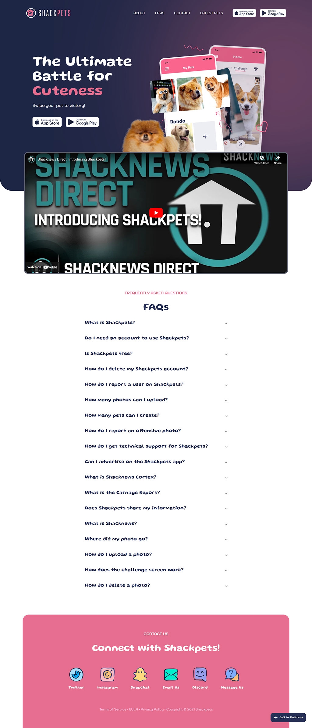
9. Shackpets | The Ultimate Battle for Cuteness
Shackpets | The Ultimate Battle for Cuteness
The design employs a vibrant and playful color palette with contrasting purples and pinks, capturing the fun and lively essence of a pet-centered community.modern, rounded sans-serif fonts paired with a bubble-like design for app screenshots evoke a friendly and accessible vibe, catering to a broad audience of pet lovers.
The interface is user-friendly, featuring clear, concise headings and an easy-to-navigate FAQ section, along with recognizable social media icons for easy engagement, all contributing to a cohesive and engaging user experience.
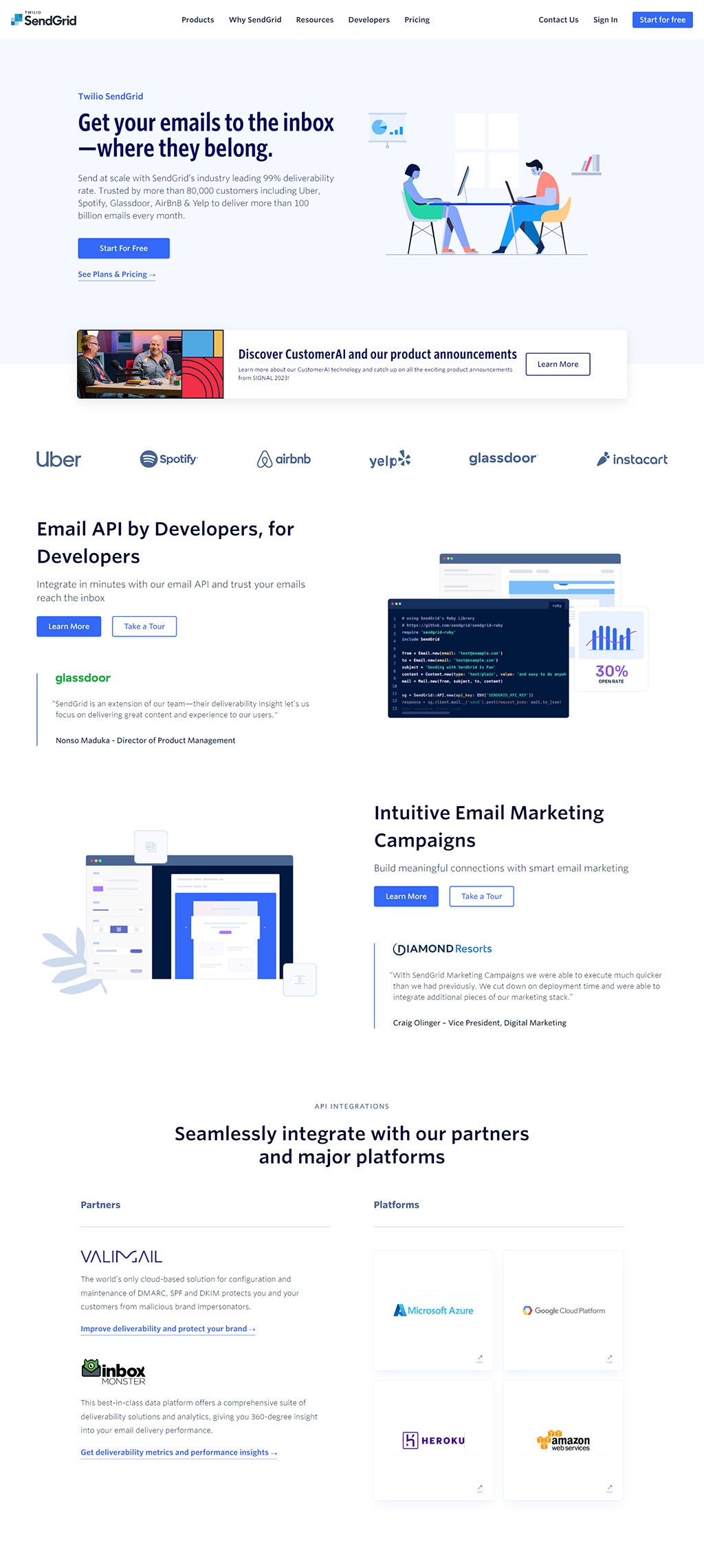
10. SendGrid | Email Delivery, API, Marketing Service
SendGrid | Email Delivery, API, Marketing Service
The design is clean and professional with a corporate blue color scheme, which is complemented by the use of white space, promoting clarity and focus on content.
Flat illustrations, subtle shadows, and gradient backgrounds add a contemporary feel while maintaining a minimalist and user-friendly interface for a technical audience.
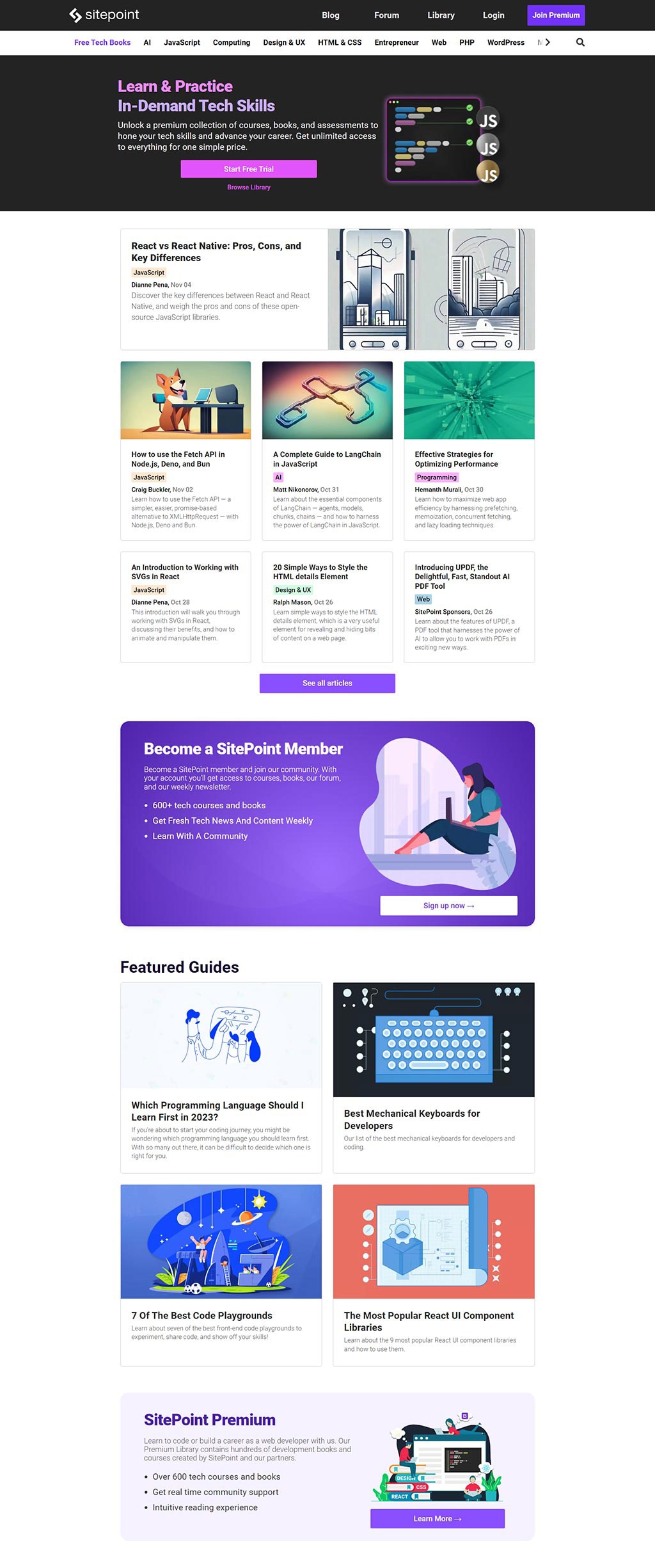
11. SitePoint | Learn HTML, CSS, JavaScript, PHP, UX & Responsive Design
SitePoint | Learn HTML, CSS, JavaScript, PHP, UX & Responsive Design
The website uses a vibrant color palette with ample use of purples and blues, giving it an energetic and inviting feel, geared towards a creative and tech-savvy audience.
The layout is structured with cards and clear divisions, making use of illustrations and images to create an engaging user experience, each serving as a visual anchor for the content.
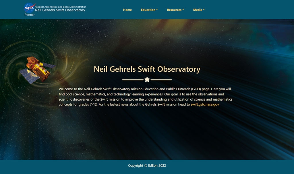
12. Neil Gehrels Swift Observatory
Neil Gehrels Swift Observatory
The website showcases a deep space theme with a central image of the Neil Gehrels Swift Observatory, set against a starry backdrop that conveys the vastness of space, aligning with the observatory's mission.
The color scheme is dark with gradient overlays of blues and greens, which supports the space imagery and helps to make the white and yellow text stand out for readability.
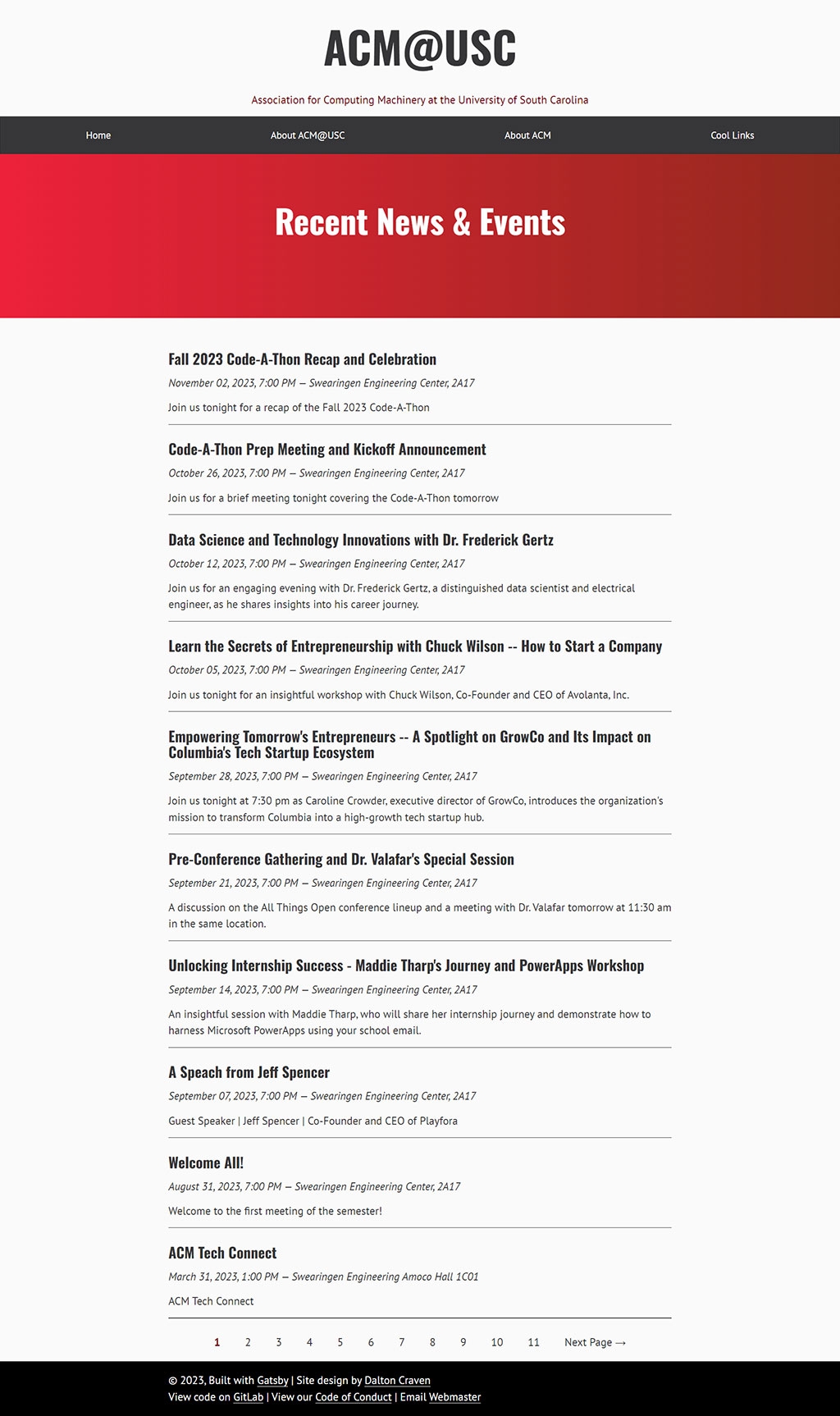
13. Home | ACM@USC
The ACM@USC website uses a classic combination of a bold red header and clean white background, creating a stark contrast that immediately draws attention to the organization's name and brand.
The layout is structured with clear, black typography against a white backdrop, which promotes readability and presents information in an organized, hierarchical manner that's easy to follow.
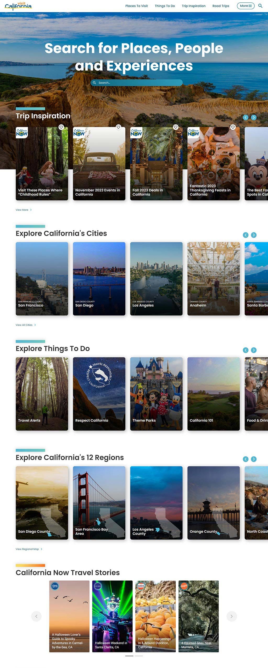
14. Visit California | Official Travel & Tourism Website
Visit California | Official Travel & Tourism Website
The Visit California website features an immersive and visually rich interface, using vibrant and attractive images to inspire travel, while neatly categorized sections guide visitors through various attractions and ideas for exploring the state.
A harmonious color palette derived from natural Californian landscapes, like blues, greens, and earth tones, adds to the visual appeal and reinforces the branding, creating an inviting and dynamic user experience.
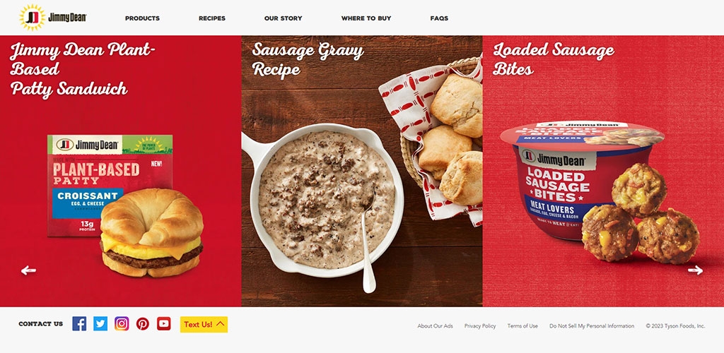
15. Jimmy Dean® Brand | Prepared Breakfast Meals
Jimmy Dean® Brand | Prepared Breakfast Meals
The Jimmy Dean website uses a warm and appetizing color scheme that reflects the brand's focus on hearty breakfast foods, with a predominant use of red and yellow tones to evoke a sense of homestyle cooking and comfort food.
The layout is simple and product-focused, showcasing the items with high-quality images and minimal text to immediately convey their appeal, making the food the hero of the page.
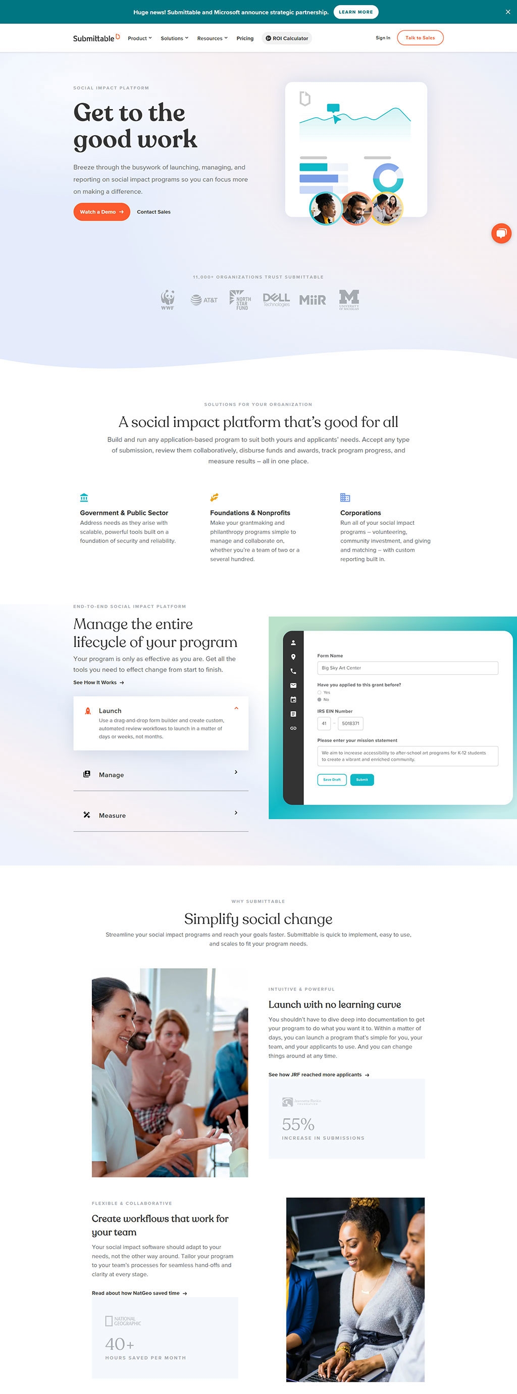
16. Submittable | The Social Impact Platform
Submittable | The Social Impact Platform
The design aesthetics of the Submittable website is modern and clean, using a lot of white space paired with soft color accents to guide users through different sections, creating a calm and organized experience.
It employs subtle gradients and high-quality, engaging imagery to humanize the interface and convey the platform's impact on real-world social initiatives, enhancing trust and relatability.
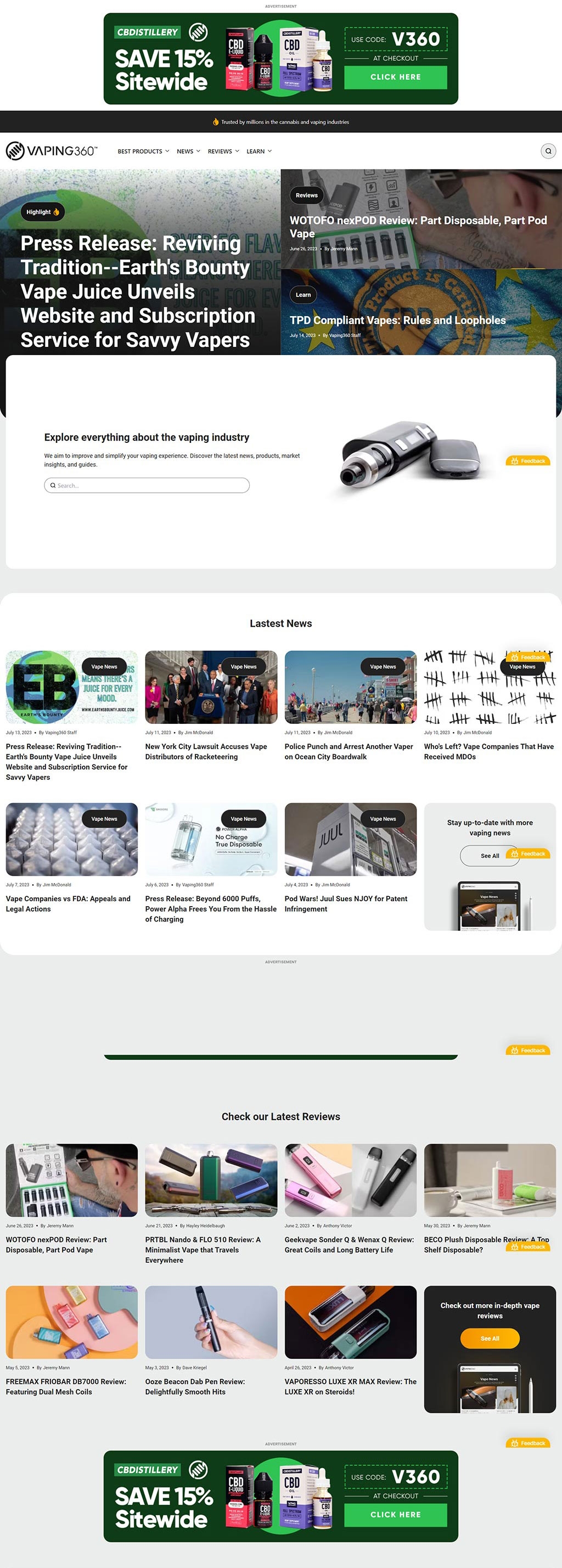
17. Vaping360 | The Home of Vaping
Vaping360 | The Home of Vaping
The website uses a clean, modern layout with a green and black color scheme that denotes freshness and ties to the vaping products’ "earthy" elements. Prominent, colorful advertisements for CBD products and discount codes command attention at the top and bottom.
Navigation is made straightforward through a structured menu bar, segmented content blocks for news and reviews, and a search bar prominently placed for ease of access. The use of large, bold headings helps to differentiate between sections and draw the eye to important content.
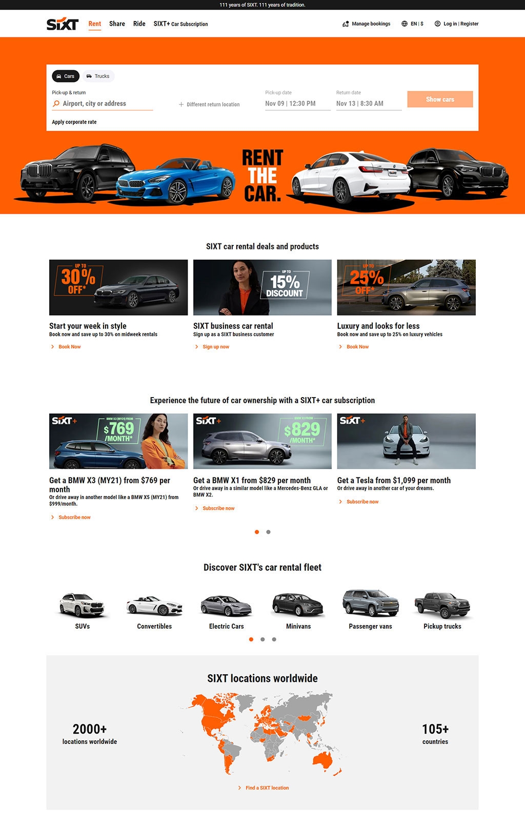
18. SIXT rent a car | Premium Car Rental & Top Deals Worldwide
SIXT rent a car | Premium Car Rental & Top Deals Worldwide
The color scheme features a bold orange that creates a strong brand identity, contrasting with the black and white tones to draw attention to key areas like calls to action and special offers.
The layout is clean and well-organized, presenting a selection of vehicle options and deals in a clear, structured manner with high-quality images that enhance the appeal of the products.
Visual elements such as the world map indicating location coverage and iconography for car categories are used effectively to provide quick, informative visuals that aid user navigation and decision-making.
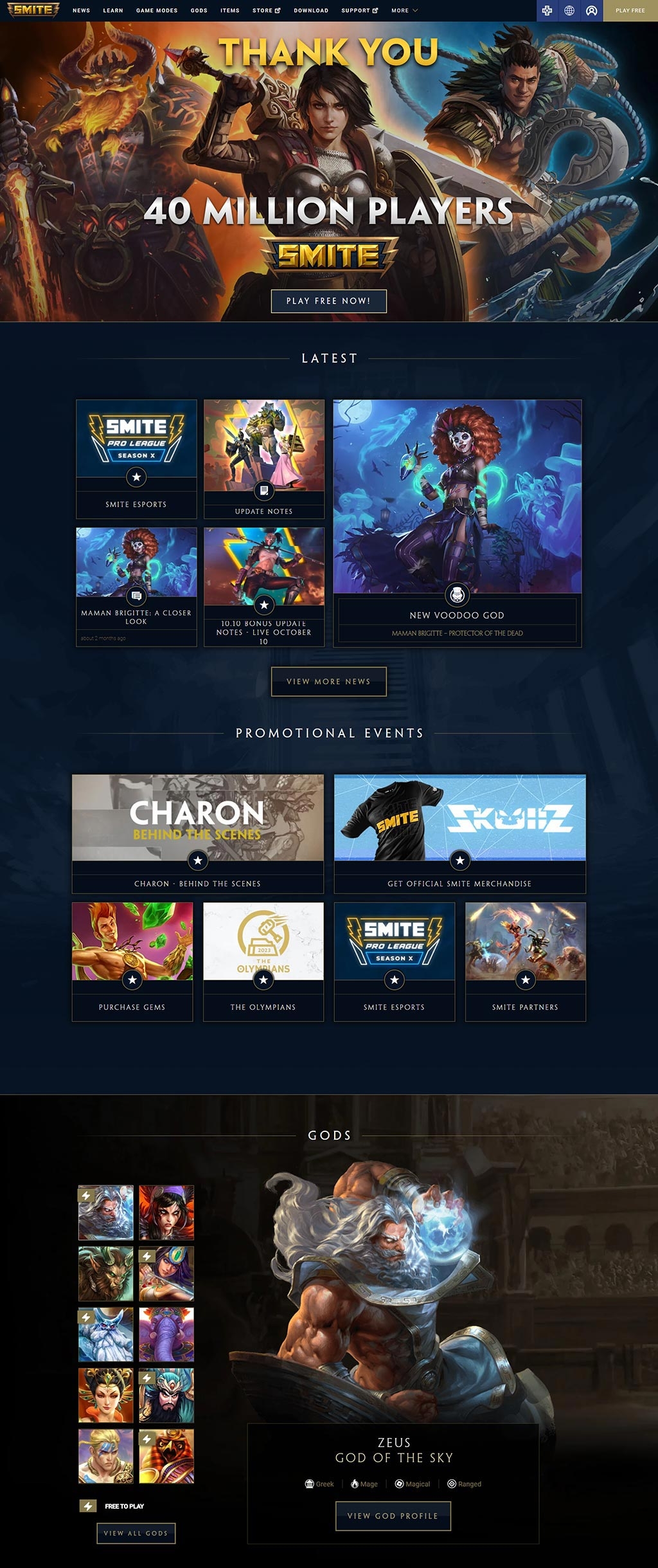
19. SMITE GAME | The Ultimate Battle
SMITE GAME | The Ultimate Battle
The top section uses a vibrant and dynamic character illustration to celebrate the 40 million player milestone, effectively creating an exciting and welcoming atmosphere for new and existing players.
The middle section is well-structured with a dark, cohesive color palette that highlights content blocks, such as latest news and promotional events, making it easy to navigate through various updates and community features.
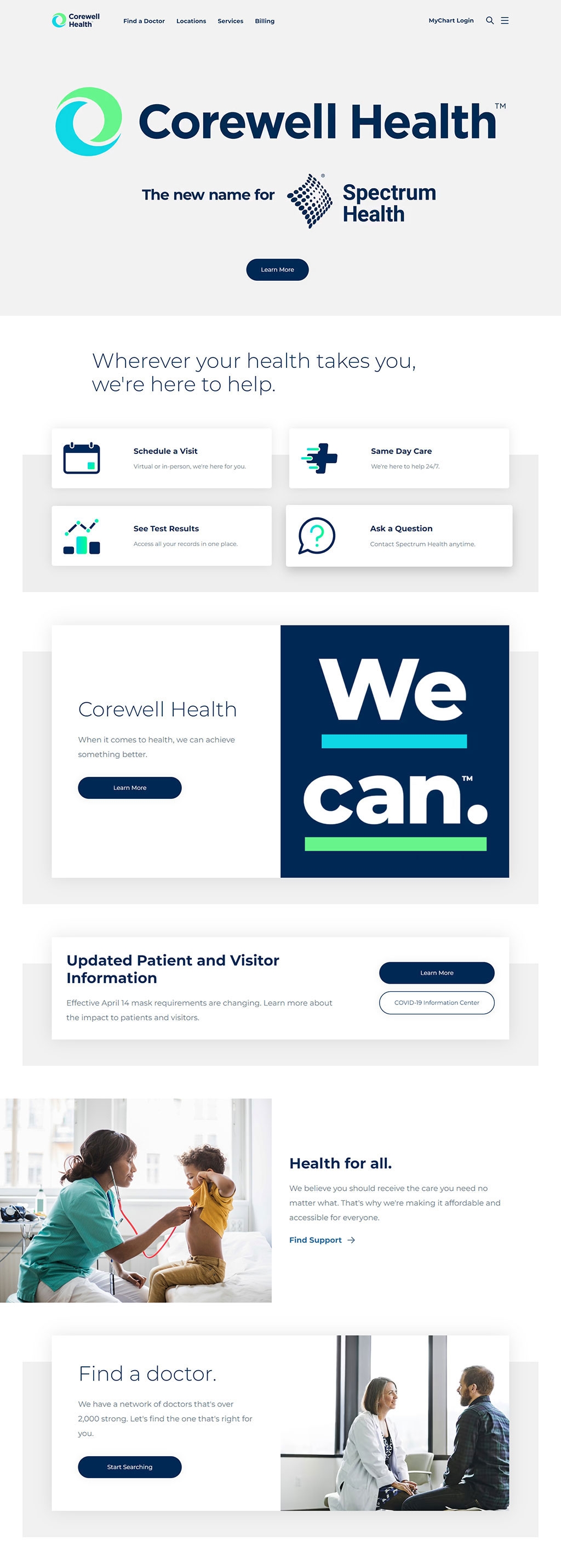
20. Corewell Health
The header employs a clean, modern design with a soothing color palette, which, along with the straightforward navigation, conveys a sense of accessibility and trust, appropriate for a healthcare provider.
Functional icons and buttons paired with concise text create an efficient user interface that promotes ease of use, inviting quick interaction for users seeking healthcare services or information.
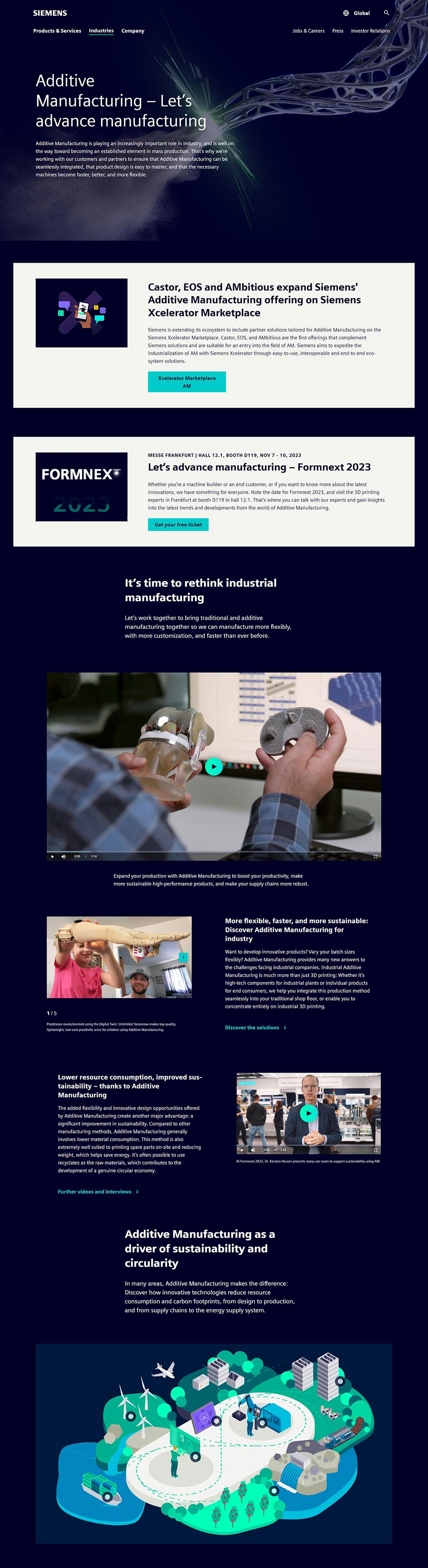
21. Siemens | Additive Manufacturing
Siemens | Additive Manufacturing
The design features a dark, modern color scheme with a futuristic network structure graphic, emphasizing the cutting-edge nature of additive manufacturing. The layout is clean, with a focus on bold typography and well-spaced sections that guide the reader through the content smoothly.
Vivid blue accents draw the eye to key information areas, such as event details for Formnext 2023, against a minimalistic white background, creating a professional and inviting look. The visual hierarchy is maintained through varied text sizes and a clear call-to-action button.
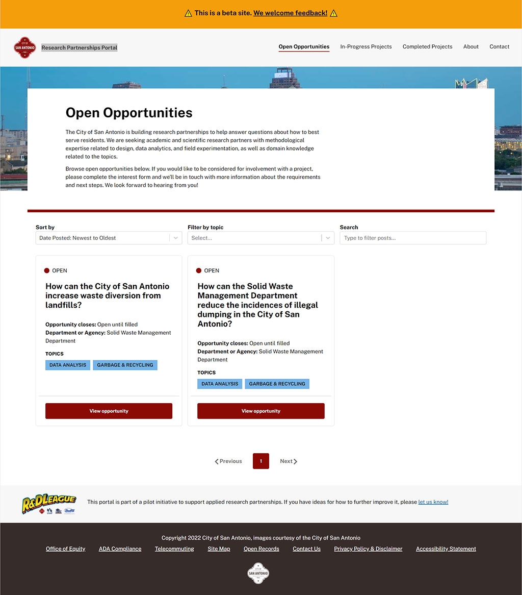
22. Research Partnerships Portal
The design employs a straightforward, user-friendly interface with a clean, grid-based layout that emphasizes functionality and easy navigation.
A color scheme aligned with the City of San Antonio's branding provides a sense of officiality and cohesion, while red call-to-action buttons stand out against a neutral background, guiding user engagement. The use of clear, sans-serif typography ensures readability and modernity throughout the portal.
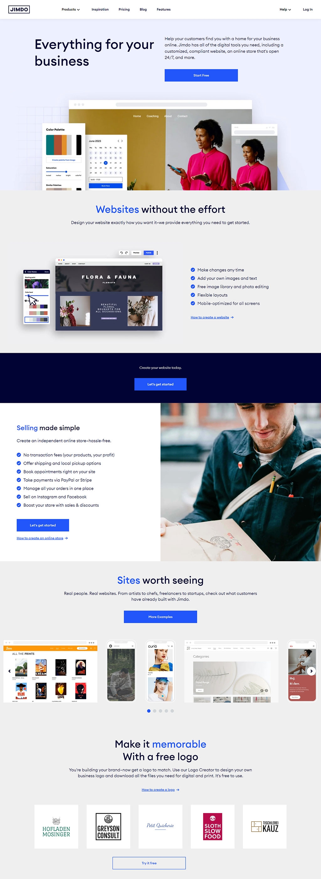
23. Jimdo | Bring Your Business Online | Websites & More
Jimdo | Bring Your Business Online
The design features a clean and modern aesthetic with a bold blue color palette that draws attention to the call-to-action button. It incorporates large, readable text and a minimalistic approach with plenty of white space for an uncluttered feel.
This section showcases an intuitive layout with a visual example of website customization, paired with a straightforward list of features for easy scanning. The use of icons next to short descriptions adds to the visual appeal and quick comprehension.
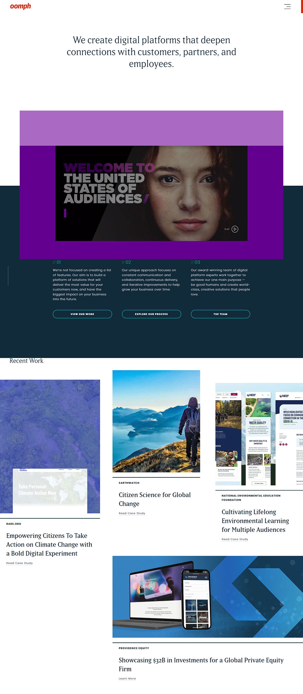
24. Oomph, Inc. | Digital Experience Design & Development
Oomph, Inc. | Digital Experience Design & Development
The design utilizes a striking purple and dark color scheme, creating a bold and professional look. The hero area combines a compelling image with a clear value proposition. A minimalist navigation bar with contrasting red highlights ensures ease of use while maintaining the overall sleek design.
Continues the theme with large, vivid imagery to showcase recent projects, paired with concise descriptions for context. The overlay of text on the images is carefully executed to maintain readability, and the use of alternating color backgrounds further defines each segment visually.
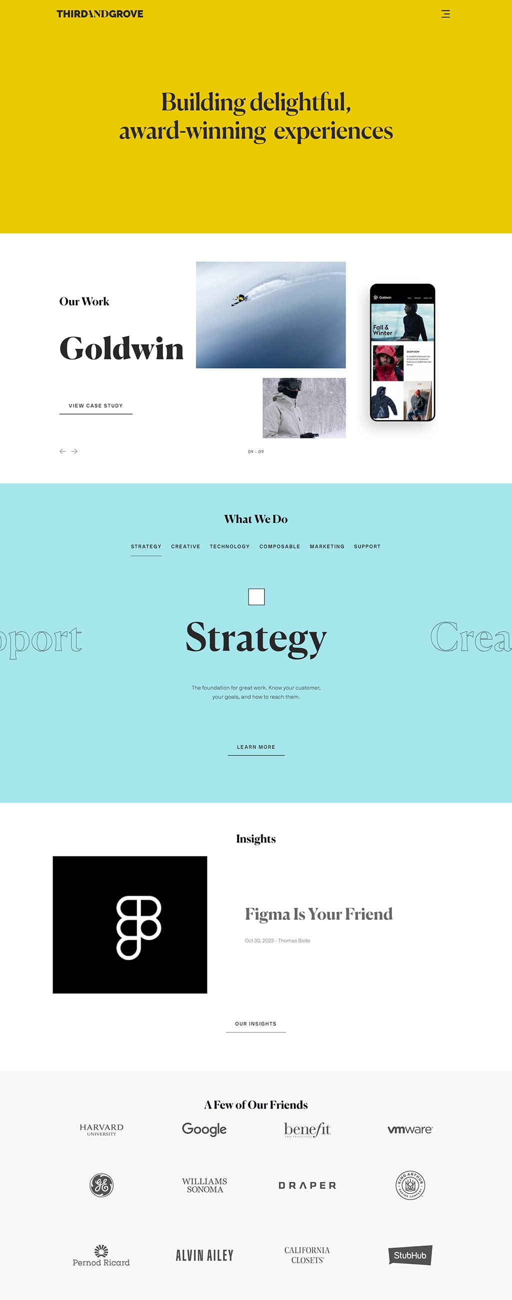
25. Third and Grove | We are an obsessive digital innovation company
Third and Grove | We are an obsessive digital innovation company
A bold, attention-grabbing yellow background with black typography creates a vibrant and energetic vibe. The typography is large and confident, reflecting a strong brand presence. Minimal elements on this section make a statement about the company's clarity and focus.
A soothing, pale teal background contrasts with the bright yellow above, bringing a calm and sophisticated feel. Clean lines, elegant sans-serif fonts, and a grid layout for services offer a professional and modern aesthetic. White space is used effectively to lead the eye through different sections.
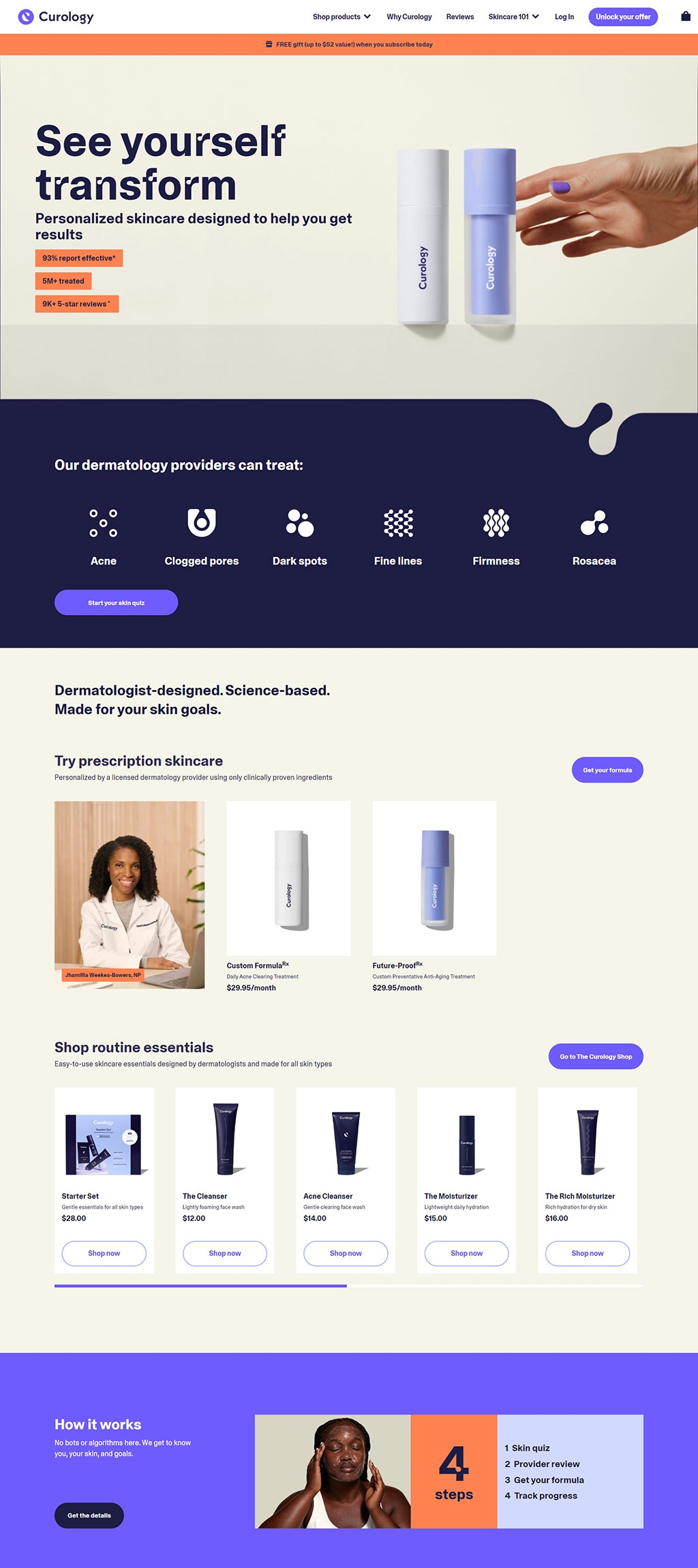
26. Curology Custom Skincare | Treat Acne, Fine Lines and More
Curology Custom Skincare | Treat Acne, Fine Lines and More
This section boasts a clean, modern layout with a harmonious blend of bold sans-serif fonts and a limited color palette that emphasizes purple and orange accents, suggesting creativity and energy. High-quality images of the product alongside a human element (hand holding the products) add a personal touch. The use of statistics and trust signals ("93% report effective*") immediately conveys efficacy and builds confidence in the brand.
A deeper purple shade sets a professional tone, paired with iconography that simplifies complex dermatological concepts into visually digestible elements, enhancing user comprehension. The call-to-action button "Start your skin quiz" is strategically placed for engagement, and the inclusion of a healthcare professional's image adds credibility to the personalized approach.
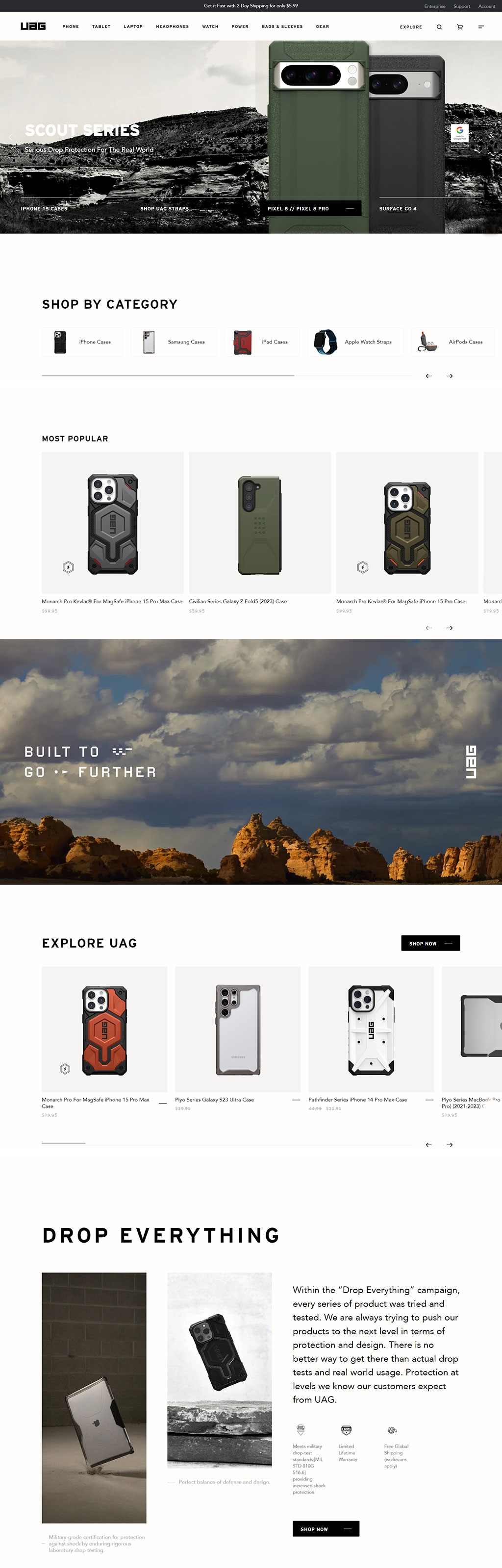
27. UAG | Rugged Cases & Mobile Accessories Built for You To Go Further
UAG | Rugged Cases & Mobile Accessories Built for You To Go Further
Utilizes a monochromatic color scheme with green accents to highlight the rugged nature of the products, employing a clean, modern layout that's easy to navigate. High-contrast visuals with sharp product images against a muted background emphasize durability and professionalism.
The product display is grid-based, providing a uniform and organized viewing experience that's user-friendly and aesthetically pleasing.a balanced mix of text and imagery, with ample white space, creates a non-cluttered, premium feel, inviting users to explore further.
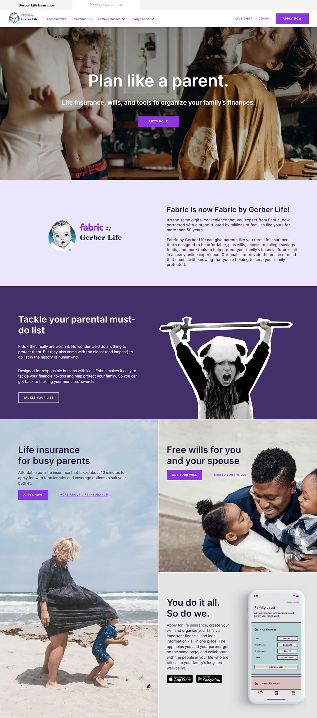
28. Fabric by Gerber Life | Life Insurance, Family Financial Tools
Fabric by Gerber Life | Life Insurance, Family Financial Tools
Warm and inviting photography creates an emotional connection with the viewer. The overlay of bold text on a subtle background ensures readability and captures attention.
The logo transition announcement is highlighted with a clean, eye-catching design that emphasizes brand continuity.contrasting text colors (black and white) against the light background provide a modern, professional feel.
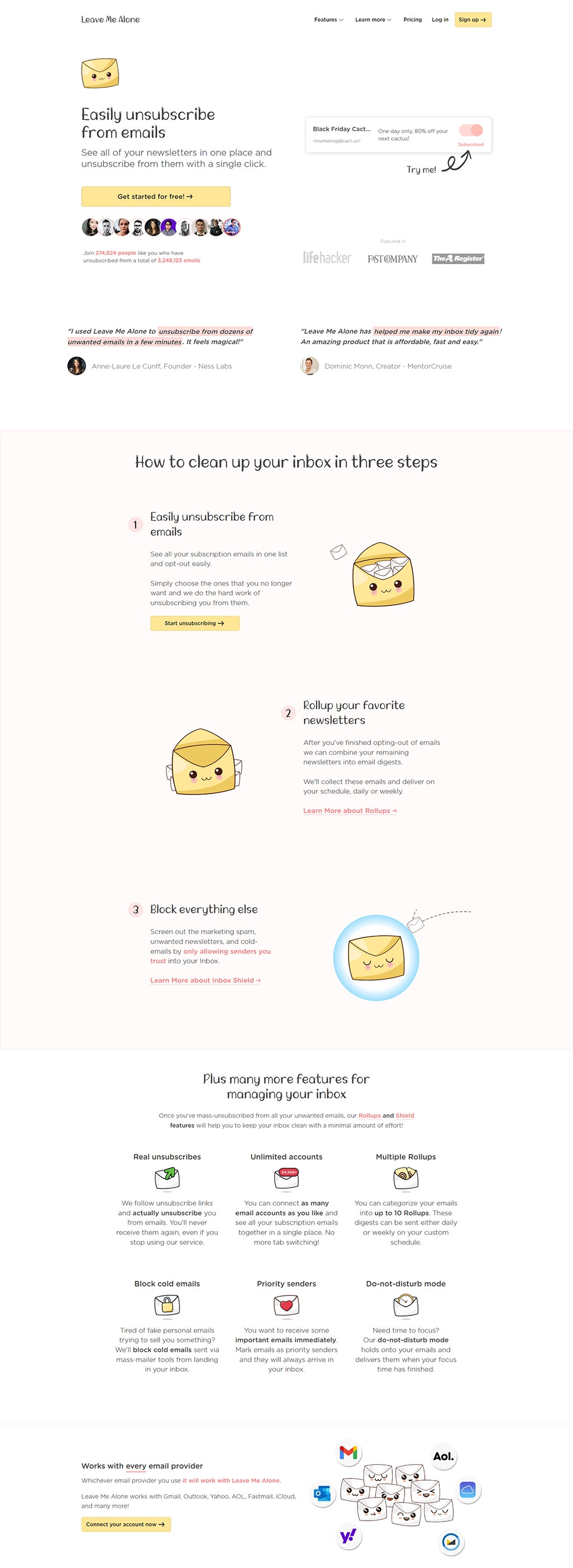
29. Leave Me Alone | Easily Unsubscribe From Unwanted Emails
Leave Me Alone | Easily Unsubscribe From Unwanted Emails
The design utilizes a clean, minimalistic approach with a friendly color palette, fostering a welcoming and user-friendly atmosphere.engaging illustrations and clear, concise typography highlight the ease of use and playful character of the service.
Consistent design elements and a well-organized layout effectively guide the user through the website's offerings and features.