


1. Tailwind UI Elevating Web Design with Professional, Responsive Components
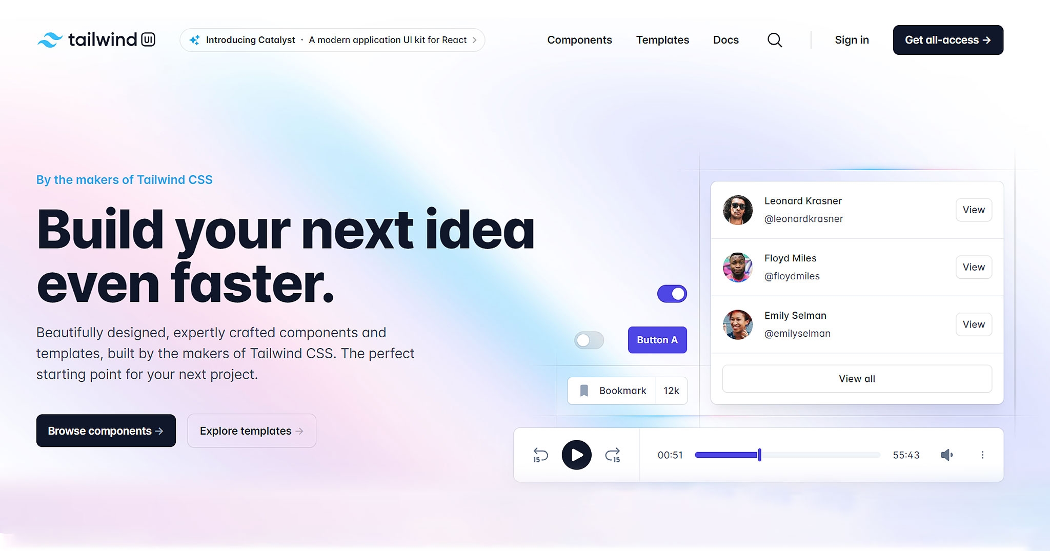
Tailwind UI is an official component library developed by the creators of Tailwind CSS, Adam Wathan and Steve Schoger. It represents a comprehensive collection of professionally designed, fully responsive HTML snippets that developers can seamlessly integrate into their Tailwind CSS projects. This library is specifically designed to help developers build beautiful, modern websites and applications faster and more efficiently, without having to start from scratch or struggle with design consistency.
Key Features:
1. Professionally Designed Components: Each component in Tailwind UI is meticulously designed by leading UI/UX experts, ensuring that they are not only visually appealing but also user-friendly and accessible.
2. Fully Responsive: Responsiveness is at the core of Tailwind UI, with all components built to be mobile-friendly and adapt smoothly across different screen sizes and devices.
3. Seamless Integration: Tailwind UI components are crafted to work out-of-the-box with Tailwind CSS, allowing developers to customize them easily using Tailwind's utility classes without writing custom CSS.
4. Comprehensive Documentation: The library comes with detailed documentation and examples, making it straightforward for developers to find and implement the components they need.
5. Wide Variety of Components: Tailwind UI covers a broad spectrum of UI elements, including navigation bars, forms, modals, cards, and much more, catering to a wide range of design needs.
6. Accessibility Focused: A significant emphasis is placed on ensuring that components meet accessibility standards, making web pages accessible to as many users as possible.
7. Regular Updates: Tailwind UI is continuously updated with new components and improvements, keeping the library fresh and aligned with the latest design trends and best practices.
Tailwind UI stands out as a valuable resource for developers and designers alike, significantly reducing development time while ensuring high-quality, responsive, and accessible designs. Its integration with Tailwind CSS offers a perfect blend of utility-first styling with the convenience of pre-designed components, making it a go-to choice for many professionals looking to elevate their web projects.
2. Headless UI Crafting Accessible, Customizable Components with Tailwind CSS
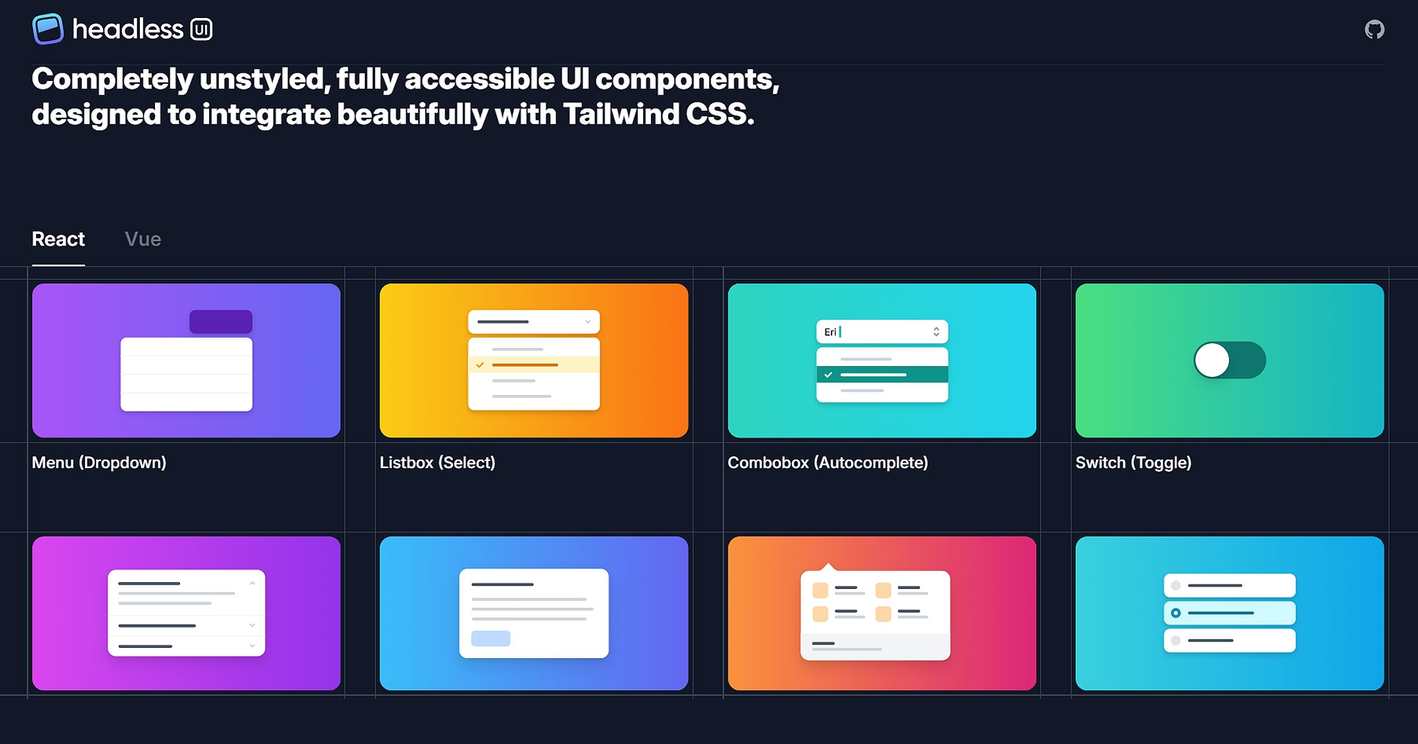
Headless UI is a groundbreaking framework that provides a suite of completely unstyled, fully accessible UI components, meticulously crafted to complement Tailwind CSS. This innovative approach allows developers to build fully interactive, accessible web components without compromising on the design aesthetics offered by Tailwind CSS. The "headless" nature of these components means they come without any predefined styles, giving developers the freedom to apply their own styling using Tailwind's utility classes, ensuring a perfect match with the rest of their project's design.
Key Features:
1. Fully Accessible Components: Accessibility is a cornerstone of Headless UI, with each component designed from the ground up to be accessible according to the WAI-ARIA standards, ensuring that applications are usable by everyone, including people with disabilities.
2. Seamless Tailwind Integration: Designed to work harmoniously with Tailwind CSS, Headless UI lets developers style components using Tailwind's utility-first classes, offering a consistent and streamlined development experience.
3. Unstyled by Default: Headless UI components are delivered without any default styling. This design choice empowers developers to apply their unique styles, ensuring that the components blend in seamlessly with their project's design language.
4. Rich Interactivity: Despite being unstyled, Headless UI components come fully equipped with the necessary interactive features and behaviors, such as toggling, selecting, and focusing, providing a solid foundation for building dynamic user interfaces.
5. Comprehensive Documentation: The library is supported by extensive documentation, including examples and guides that demonstrate how to implement and customize the components effectively within your projects.
6. Wide Range of Components: Headless UI offers a diverse array of components, including dropdowns, modals, toggles, and menus, catering to a broad spectrum of UI design requirements.
Headless UI addresses a critical need in the web development community for a set of foundational, interactive, and accessible components that can be fully customized to match any design system. Its integration with Tailwind CSS offers a powerful combination for developers looking to create bespoke, accessible web applications without sacrificing the convenience and efficiency of using a utility-first CSS framework.
3. Tailwind Elements: Bridging Bootstrap Design with Tailwind Flexibility
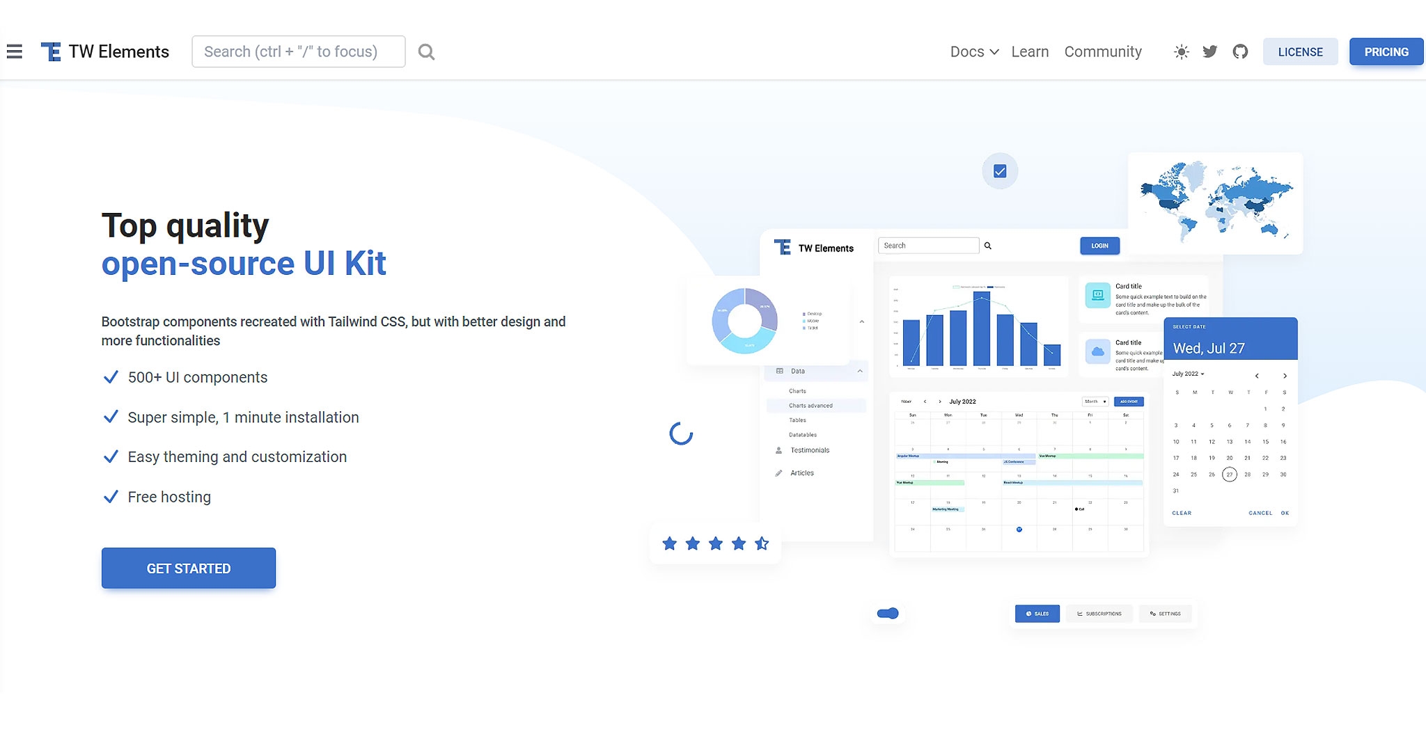
Tailwind Elements represents a significant innovation in the world of web development, offering a vast collection of components and interactive elements that are meticulously crafted using Tailwind CSS. This library stands out for its unique approach of emulating the comprehensive component suite typically associated with Bootstrap, yet it is infused with the utility-first philosophy of Tailwind CSS. This blend provides developers with the best of both worlds: the extensive component options of Bootstrap combined with the customization and design flexibility that Tailwind CSS is renowned for.
Key Features:
1. Extensive Component Library: Tailwind Elements boasts a broad array of UI components, ranging from buttons and forms to modals and cards, ensuring developers have access to every possible element they might need for their projects.
2. Bootstrap-Inspired Design: By mirroring the familiar components of Bootstrap, Tailwind Elements offers a sense of familiarity to those accustomed to Bootstrap's design patterns, making the transition to Tailwind CSS smoother and more intuitive.
3. Utility-First Approach: Staying true to Tailwind's core principles, all components in Tailwind Elements are built using a utility-first approach, allowing for unprecedented levels of customization and flexibility in design.
4. Interactive Elements: Beyond static components, Tailwind Elements includes interactive elements such as dropdowns, carousels, and modals, enhancing the user experience with dynamic, responsive interactions.
5. Responsive and Mobile-Friendly: Every component in Tailwind Elements is designed to be fully responsive, ensuring seamless display and functionality across all devices and screen sizes.
6. Seamless Integration: Tailwind Elements is designed to integrate effortlessly into any Tailwind CSS project, enabling developers to incorporate its components without disrupting their existing workflow.
Tailwind Elements is a transformative addition to the Tailwind CSS ecosystem, addressing the need for a comprehensive, utility-first component library that resonates with the familiarity and breadth of Bootstrap's components. It empowers developers to craft bespoke, responsive, and interactive web interfaces with ease, making it an invaluable resource for both rapid prototyping and the development of intricate web applications.
4. Twind: Unleashing Tailwind CSS Directly in JavaScript Without a Build Step
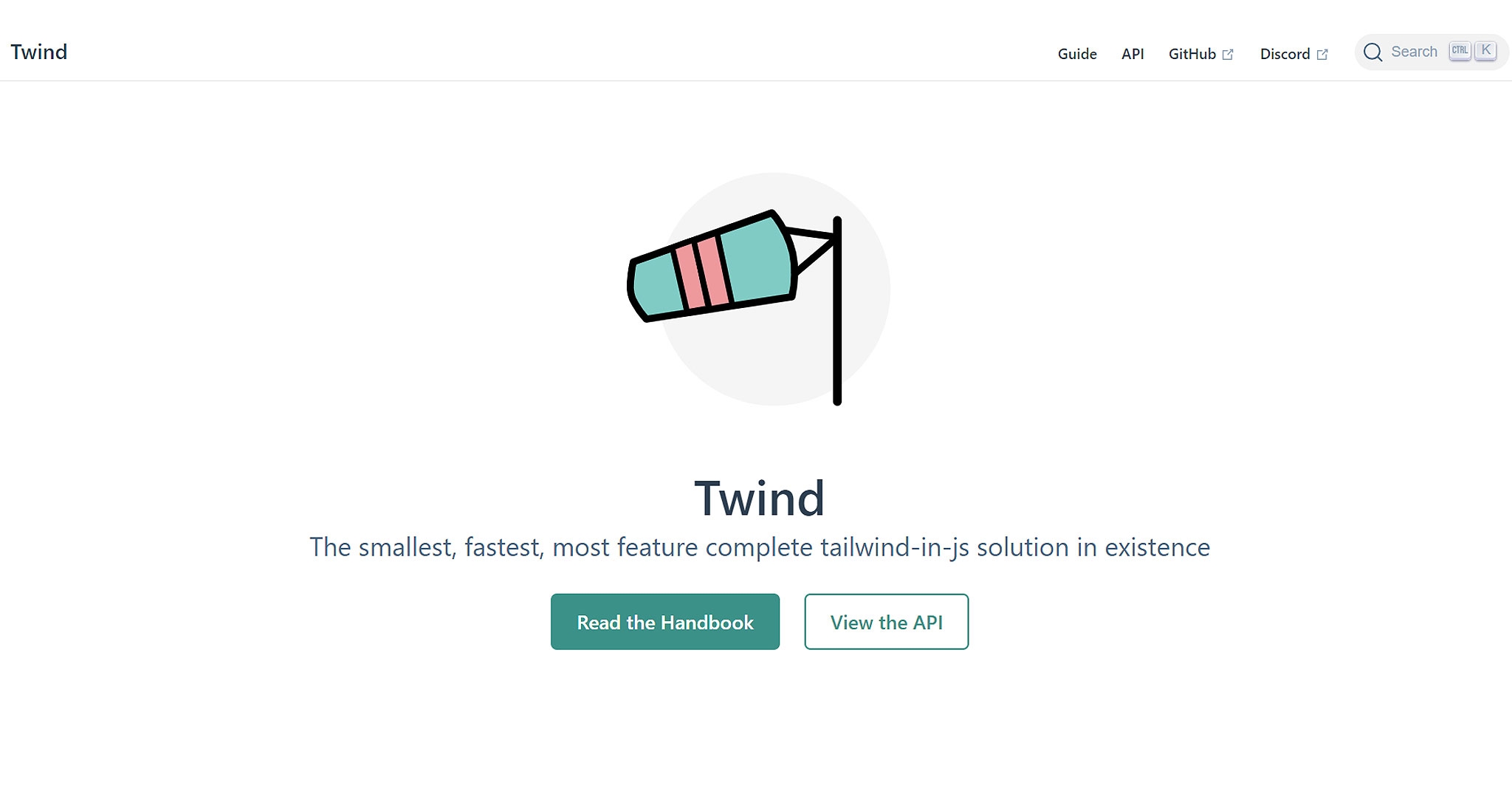
Twind is an innovative approach to utilizing Tailwind CSS, specifically designed to streamline the development process by allowing developers to harness the power of Tailwind's utility-first CSS directly within JavaScript. This groundbreaking tool eliminates the traditional build step required to compile Tailwind CSS, enabling developers to write Tailwind's utility classes straight into their HTML or JS files. Twind's unique methodology not only simplifies the development workflow but also significantly reduces the barrier to entry for those looking to integrate Tailwind CSS into their projects.
Key Features:
1. No Build Step Required: Twind's most significant advantage is its ability to function without a traditional CSS build process, making it incredibly efficient and easy to set up within any project.
2. Seamless Integration: It offers seamless integration with existing JavaScript projects, frameworks, and libraries, making it an excellent choice for projects ranging from vanilla JavaScript to complex frameworks like React, Vue, or Angular.
3. Lightweight and Fast: Twind is designed to be incredibly lightweight, ensuring minimal impact on load times and performance. Its on-the-fly interpretation of Tailwind's utility classes ensures a fast development experience without sacrificing speed or efficiency.
4. Dynamic Styling Capabilities: With Twind, developers can dynamically generate and apply Tailwind utility classes directly in JavaScript, offering a level of flexibility and dynamism that static CSS files cannot match.
5. Customization and Extensibility: Twind supports Tailwind CSS customization and plugins, allowing developers to extend its functionality and tailor it to the specific needs of their project.
6. Developer Experience: Twind enhances the developer experience by providing immediate feedback on styling changes, eliminating the need to wait for builds to compile to see the results of CSS changes.
Twind stands out as a revolutionary tool in the web development ecosystem, offering a novel way to leverage Tailwind CSS's utility-first approach within JavaScript projects. Its elimination of the build step, combined with its flexibility, performance, and ease of use, makes it an attractive option for developers looking to streamline their workflow and embrace the utility-first paradigm in a more dynamic and interactive development environment.
5. Tailblocks: Streamlining Web Design with Pre-Designed Tailwind CSS Blocks
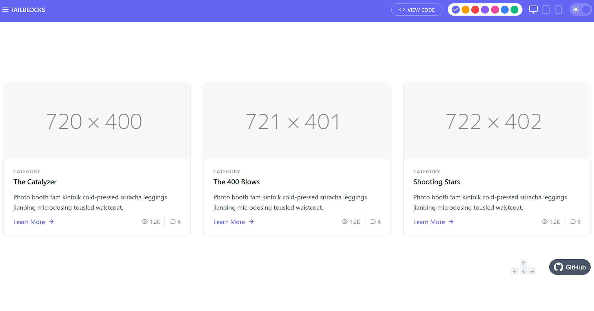
Tailblocks is a curated collection of ready-to-use blocks built with Tailwind CSS, designed to cater to a wide range of web components such as headers, footers, testimonials, and more. This resource is invaluable for developers and designers looking to expedite the process of creating visually appealing and responsive web layouts. By offering a variety of pre-designed blocks, Tailblocks significantly reduces development time, allowing for rapid prototyping and the assembly of web pages with minimal effort.
Key Features:
1. Wide Variety of Components: Tailblocks encompasses a diverse set of components, ensuring developers have access to a broad spectrum of design elements for every part of a web page, from navigation bars to pricing tables.
2. Ready-to-Use: Each block in Tailblocks is fully coded and ready to integrate into a Tailwind project, making it possible to construct complex layouts quickly without starting from scratch.
3. Responsive Design: All Tailblocks components are designed to be responsive, ensuring that web pages built with these blocks look great and function well on any device, from desktops to smartphones.
4. Highly Customizable: While Tailblocks provides pre-designed blocks, they are built using Tailwind CSS, which means each block can be easily customized with Tailwind's utility classes to fit the unique style and branding of any project.
5. Ease of Use: Tailblocks is designed to be straightforward and user-friendly, allowing even those new to Tailwind CSS to quickly understand and utilize the blocks in their projects.
6. Community-Driven: Tailblocks benefits from contributions and feedback from the Tailwind community, ensuring that the library continues to grow and improve over time.
Tailblocks stands out as a practical and efficient solution for web developers and designers looking to leverage the power of Tailwind CSS with minimal effort. Its collection of pre-designed blocks not only accelerates the development process but also inspires creativity, allowing for the quick assembly of professional-looking websites that are both responsive and customizable. Whether for prototyping, educational purposes, or production projects, Tailblocks offers a valuable set of tools to enhance productivity and design quality.
6. Tailwind Toolbox: Accelerating Web Projects with Free Tailwind CSS Templates and Components
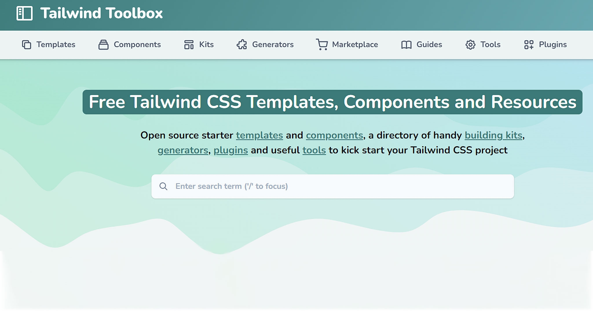
Tailwind Toolbox is an invaluable resource for web developers and designers, providing a comprehensive, free, and open-source collection of templates, components, and themes specifically designed for use with Tailwind CSS. This repository is aimed at offering a jumpstart to projects by providing a foundational structure that can be easily customized and built upon, significantly reducing the initial setup time and effort typically required when starting a new project from scratch.
Key Features:
1. Diverse Range of Templates: Tailwind Toolbox includes a wide variety of starter templates, from simple landing pages and admin dashboards to complex application layouts, catering to a broad spectrum of web development needs.
2. Open-Source and Community-Driven: As an open-source project, Tailwind Toolbox benefits from the contributions of developers worldwide, ensuring a constantly growing and evolving library of resources.
3. Ready-to-Use Components: Beyond templates, the toolbox offers a collection of individual components such as buttons, forms, and navigation bars, which can be easily integrated into existing projects to enhance functionality and aesthetics.
4. Customizable Themes: The repository includes themes that can be adopted as-is or customized to fit the branding and design requirements of specific projects, providing a quick way to ensure visual consistency across a website or application.
5. Seamless Integration with Tailwind CSS: All templates and components are built to leverage Tailwind CSS's utility-first approach, allowing for easy customization and scalability.
6. No Additional Dependencies: Tailwind Toolbox is designed to work seamlessly with Tailwind CSS without the need for additional dependencies, ensuring a lightweight and efficient development process.
Tailwind Toolbox serves as a cornerstone for the Tailwind CSS community, offering a rich set of resources that empower developers and designers to quickly bring their ideas to life. Its emphasis on customization, coupled with the utility-first philosophy of Tailwind CSS, makes it an essential tool for anyone looking to streamline their web development workflow while maintaining high standards of design and functionality. Whether for rapid prototyping, educational projects, or production-ready applications, Tailwind Toolbox provides the foundational elements needed to start with confidence and efficiency.
7. Windster: Elevating Admin Panels with a Free Tailwind CSS Dashboard Template
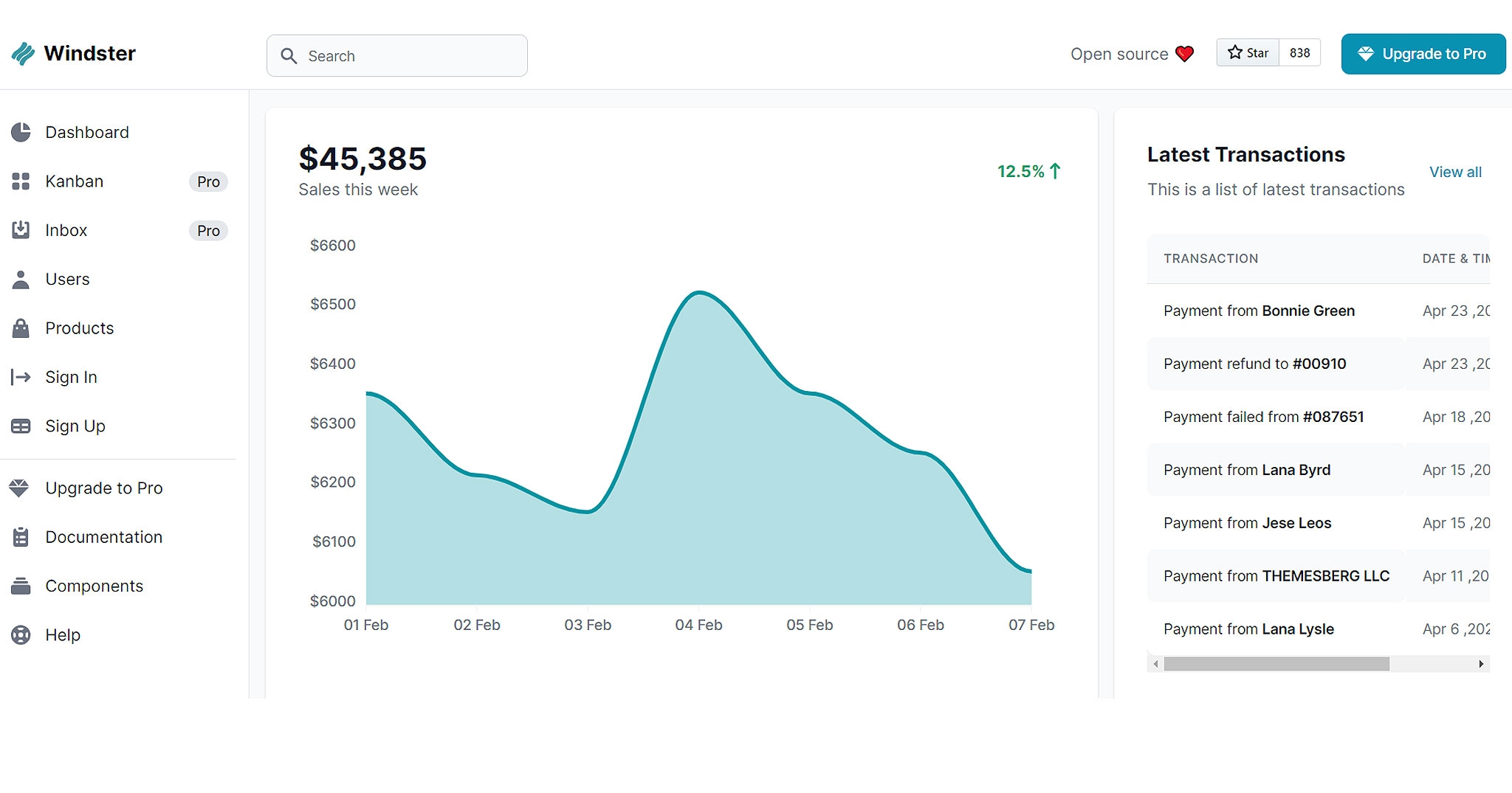
Windster is a standout offering in the realm of web development tools, presenting itself as a free and open-source dashboard template crafted with Tailwind CSS. This template is specifically designed to serve the needs of developers and designers seeking a robust and aesthetically pleasing admin panel for their web applications. Windster combines the utility-first approach of Tailwind CSS with a keen eye for design, resulting in a dashboard that is not only highly functional but also visually appealing.
Key Features:
1. Comprehensive Dashboard Layout: Windster provides a fully designed admin panel layout, complete with all the sections and components commonly needed in a dashboard, such as sidebar navigation, charts, tables, and form elements.
2. Modular Component Design: The dashboard is built using a variety of modular components, allowing developers to easily customize and reconfigure the layout to suit the specific needs of their project.
3. Responsive and Adaptive: Designed with responsiveness in mind, Windster ensures that the dashboard looks great and functions seamlessly across all device sizes, from desktops to mobile phones.
4. Utility-First with Tailwind CSS: Leveraging the power of Tailwind CSS, Windster allows for easy styling and customization of components, adhering to the utility-first principles that enable rapid design iterations.
5. Open-Source Community Support: Being open-source, Windster benefits from the contributions and feedback of a wide community of developers, ensuring continuous improvement and updates to the template.
6. Ready-to-Use: Windster is designed to be a turnkey solution for admin panels, meaning developers can quickly integrate the template into their projects with minimal setup required.
Windster emerges as a valuable resource in the arsenal of web developers and designers, offering a free, open-source dashboard template that marries functionality with aesthetics. Its use of Tailwind CSS ensures that customization and scalability are at the forefront, allowing for the creation of admin panels that are not only effective in their function but also align with the latest design trends. Whether for commercial projects, personal use, or educational purposes, Windster provides a solid starting point for anyone looking to develop an admin panel with efficiency and style.
8. Tailwind Starter Kit: Jumpstart Your Web Projects with Creative Tim's Open-Source Resource
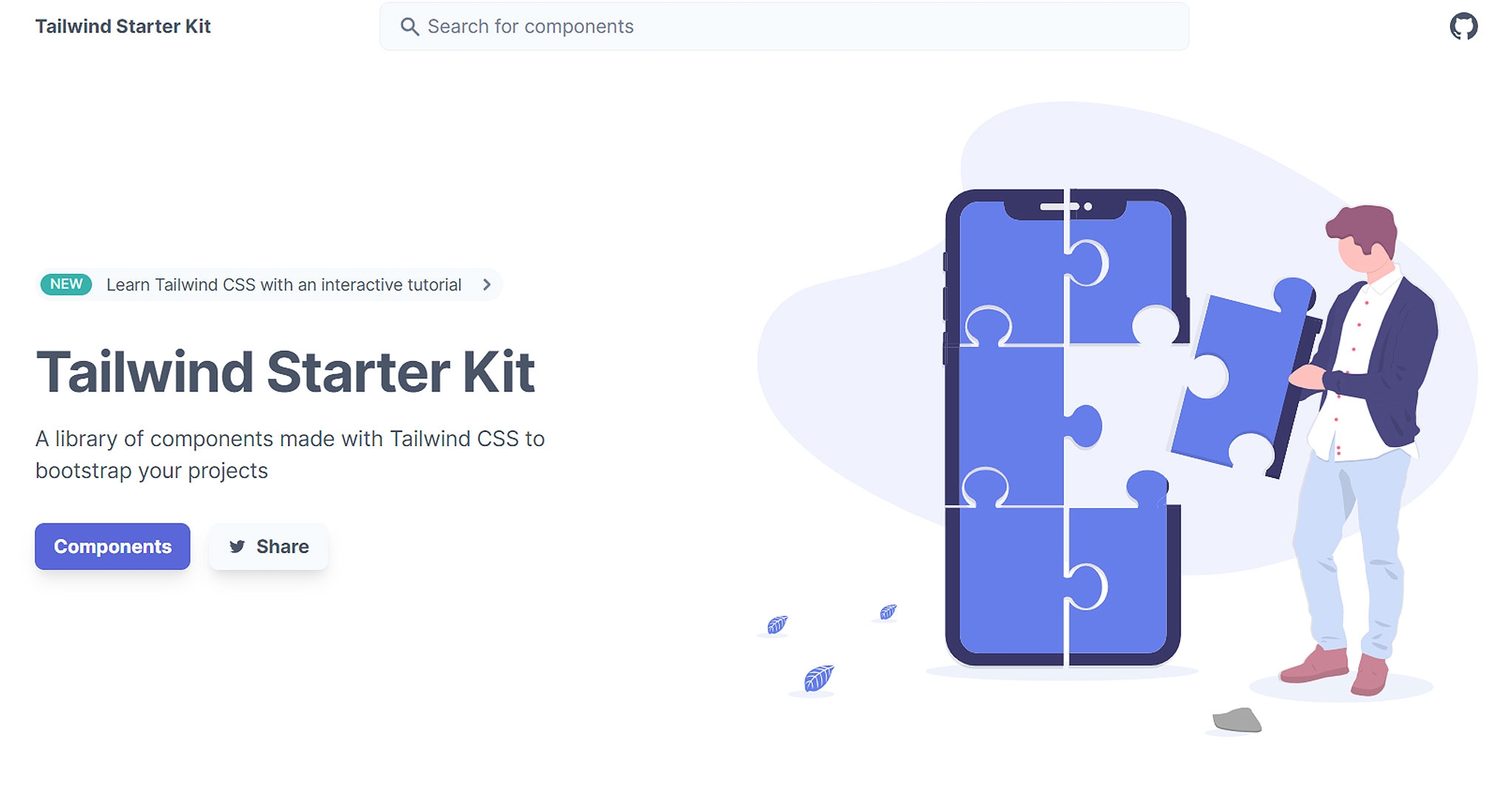
The "Tailwind Starter Kit" is a remarkable addition to the world of web development, generously offered as a free and open-source resource by Creative Tim. Tailwind CSS enthusiasts and newcomers alike can now embark on their projects with ease, thanks to this comprehensive starter kit. It features a diverse array of components and templates, meticulously crafted to provide a seamless starting point for web developers looking to harness the power of Tailwind CSS in their projects.
Key Features:
1. Diverse Component Library: The Tailwind Starter Kit encompasses a rich collection of components, covering everything from navigation bars, forms, and cards to modals, notifications, and more. This diverse range ensures that developers have the building blocks they need for crafting sophisticated web interfaces.
2. Professional Templates: The kit includes professionally designed templates for common web layouts, such as landing pages, dashboards, and e-commerce pages. These templates offer a polished and cohesive look and feel right out of the box.
3. Customizable Design: While the starter kit provides ready-to-use components and templates, it's built with Tailwind CSS's utility-first philosophy. This means that developers can easily customize the appearance and styling of each element using Tailwind's utility classes.
4. Responsive and Mobile-Friendly: All components and templates in the Tailwind Starter Kit are designed to be responsive, ensuring that websites built with this kit will look great and function seamlessly on various screen sizes and devices.
5. Open-Source and Community-Driven: Being open-source, the Tailwind Starter Kit is continuously improved and updated with contributions and feedback from the developer community, ensuring that it stays current and relevant.
6. Ease of Integration: The kit is engineered for straightforward integration into Tailwind CSS projects, eliminating the need for extensive setup and allowing developers to get started quickly.
The Tailwind Starter Kit, graciously provided by Creative Tim, stands as a testament to the power and versatility of Tailwind CSS. It empowers developers to expedite their web development endeavors, offering a comprehensive suite of components and templates that are both professionally designed and highly customizable. Whether you're a seasoned developer looking to save time or a newcomer eager to explore Tailwind CSS, this starter kit provides an excellent springboard for your web projects.
9. Flowbite: Elevating Tailwind CSS with Interactive Components and Alpine.js Integration
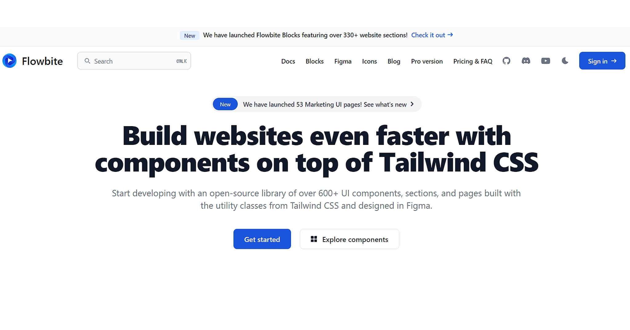
"Flowbite" emerges as a dynamic and indispensable asset in the world of web development, presenting itself as a comprehensive Tailwind CSS components library. This resource goes beyond the standard set of Tailwind components by offering a rich collection of interactive elements, including modals, dropdowns, datepickers, and more. What sets Flowbite apart is its seamless integration with Alpine.js, which introduces a layer of interactivity to the components, enhancing the user experience and enabling developers to craft sophisticated web applications with ease.
Key Features:
1. Interactive Components: Flowbite extends the capabilities of Tailwind CSS by providing a variety of interactive components that empower developers to create dynamic and engaging user interfaces. These include modals for user interactions, dropdowns for navigation, and datepickers for date selection, among others.
2. Alpine.js Integration: Flowbite takes full advantage of Alpine.js, a minimal framework for composing JavaScript interactivity. This integration ensures that the interactive components are not just visually appealing but also fully functional and responsive.
3. Comprehensive Documentation: To facilitate ease of use, Flowbite is accompanied by comprehensive documentation and examples, guiding developers on how to effectively implement and customize the components within their projects.
4. Fully Customizable: All components in Flowbite are designed with customization in mind. Developers can easily tailor the appearance and behavior of these components using Tailwind CSS classes and Alpine.js directives to align with their project's design and functionality requirements.
5. Responsive Design: Flowbite components are created to seamlessly adapt to different screen sizes and devices, ensuring a consistent and optimized user experience across desktops, tablets, and mobile phones.
6. Community-Driven: Flowbite thrives on the contributions and feedback of the developer community, ensuring that it remains up to date, well-maintained, and continually improved.
Flowbite emerges as a powerful resource for web developers seeking to elevate their projects with interactive elements built on top of Tailwind CSS. Its integration with Alpine.js ensures that the components not only look polished but also provide seamless and responsive interactivity. With its focus on customization and ease of use, Flowbite empowers developers to create dynamic web applications that captivate users and deliver exceptional functionality. Whether for prototyping, production, or enhancing existing projects, Flowbite adds a layer of interactivity that can take web development to the next level.
10. Kutty: Empowering Web Developers with Accessible and Reusable Tailwind CSS Components
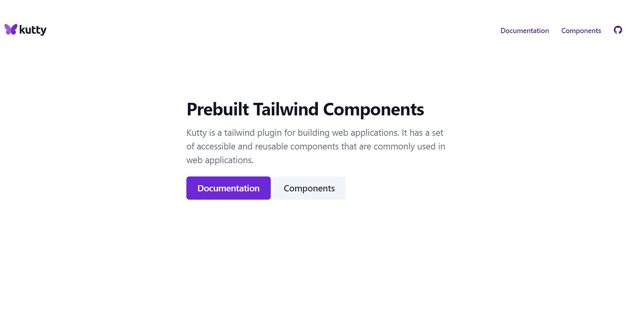
"Kutty" an exceptional component library for Tailwind CSS, stands as a valuable resource for web developers and designers alike. It offers a comprehensive collection of accessible and reusable components that are frequently utilized in web applications. Kutty's primary objective is to streamline the development process by providing a repository of pre-designed components that adhere to accessibility best practices, thereby accelerating the creation of user-friendly web interfaces.
Key Features:
1. Diverse Component Library: Kutty boasts a diverse range of components, covering a multitude of web application requirements. From buttons, forms, and alerts to modals, navigation menus, and tooltips, it caters to a broad spectrum of user interface elements.
2. Accessibility-Focused Design: Each component in Kutty is crafted with accessibility in mind, ensuring that web applications built with these components are inclusive and compliant with accessibility standards, making them accessible to users with disabilities.
3. Reusable and Modular: The components are designed to be highly modular and reusable. Developers can easily integrate them into their projects, promoting code consistency and efficiency.
4. Tailwind CSS Integration: Kutty is designed to work seamlessly with Tailwind CSS, leveraging Tailwind's utility-first approach for easy styling and customization of components.
5. Clear Documentation: To facilitate ease of use, Kutty is accompanied by clear and comprehensive documentation, offering guidance on how to effectively implement and customize the components.
6. Open-Source and Community-Driven: Being open-source, Kutty thrives on community contributions and feedback, ensuring continuous improvement and updates to the library.
Kutty emerges as an indispensable asset in the toolkit of web developers and designers who aim to build accessible and user-friendly web applications. Its rich collection of components, dedication to accessibility, and integration with Tailwind CSS make it a versatile choice for projects of all sizes. Whether you're developing a personal website, a business application, or an educational platform, Kutty provides a solid foundation of accessible components that can enhance both the functionality and inclusivity of your web interfaces.
